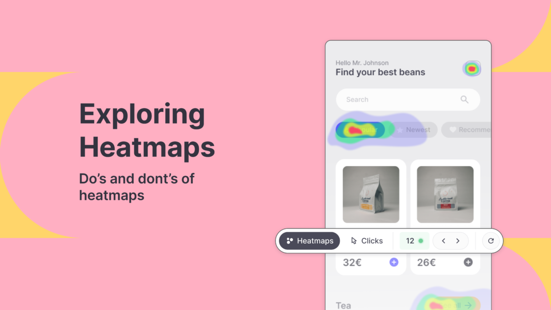
Understanding how users interact with digital interfaces is a key element in creating exceptional user experiences. Heatmaps have emerged as a powerful tool for providing the necessary insight into this aspect of user behavior. Heatmaps offer a visual representation of data, providing valuable insight into what users click on, how they navigate through a website or application, and even where they focus their attention with eye-tracking. In this blog, we will be exploring the origins of heatmaps, their types, their rise in popularity, as well as best practices and mistakes to avoid while conducting UX research.
Origins of Heatmaps and Introduction to UX Design
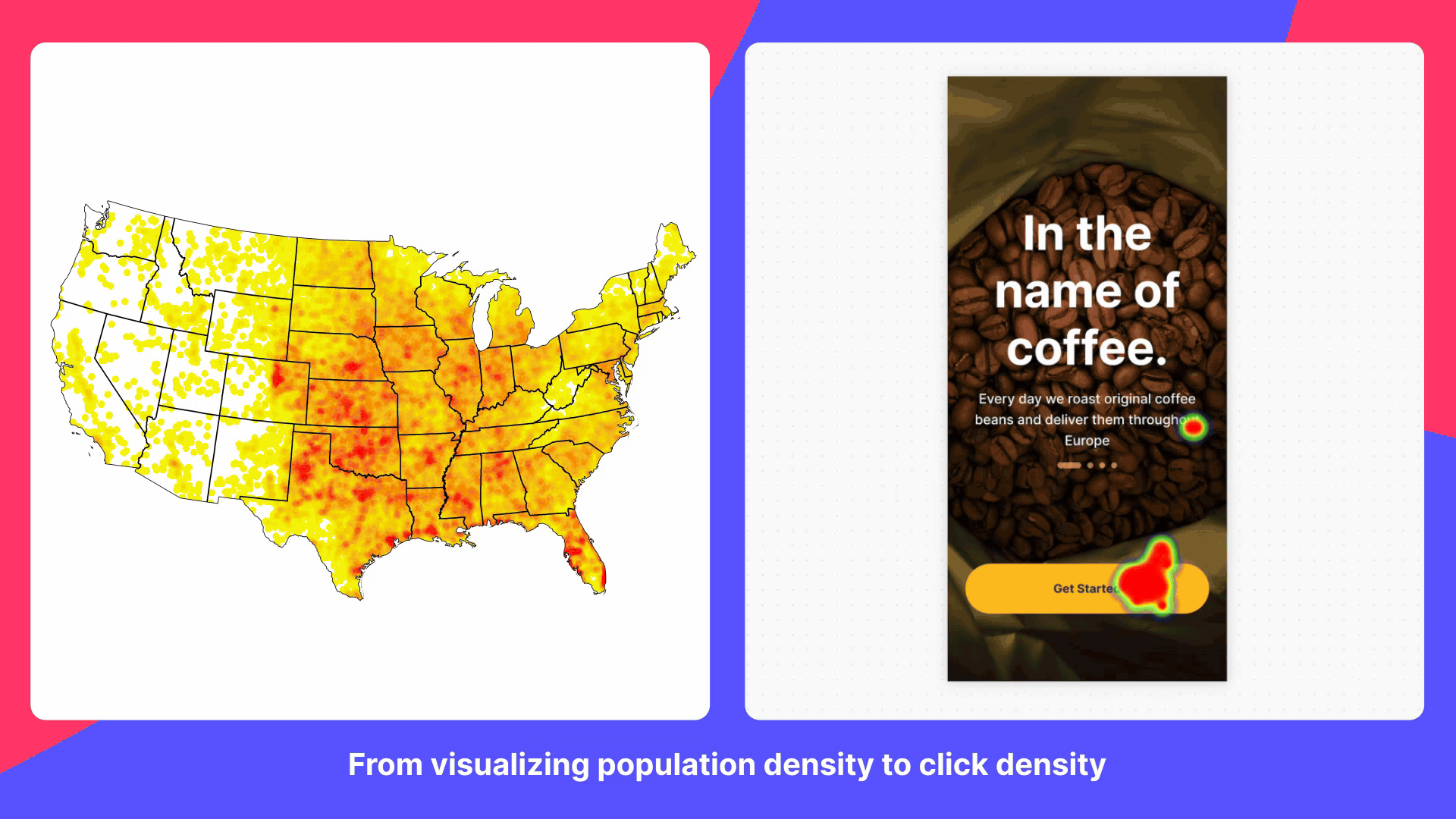
Most of us are very familiar with website heatmaps and used to having them as a core part of our UX research, but heatmaps have a rich history that traces back to the field of cartography. Originally designed to represent geographic data, such as population density or temperature variations, heatmaps offered a visual means to convey complex information in a concise and intuitive manner. Over time, this concept transcended cartography and found its way into the realm of user experience design. With the rise of digital interfaces, UX professionals sought innovative methods to understand user behavior and optimize interactions. Heatmaps emerged as a powerful tool, enabling designers to visualize and analyze user engagement, attention, and interactions on websites and applications. Since the adoption of heatmaps into the field of UX design and research, they have become invaluable for uncovering insights into user behavior.
Today, a wide variety of digital creators, such as data analysts, marketers, product development teams, and UX designers use heatmaps to identify and visualize the hottest (most viewed or used) as well as the coldest (least viewed or used) areas of a website, application, or creative design. Here we have to give credit to Hotjar, which played a big role in popularizing heatmaps in UX research.
Popularization of Heatmaps
Although modern use of heatmaps goes back as far as the 1990s, when it was first introduced and trademarked to graphically display complex information in financial markets, it is fair to say it took another two decades for it to become a mainstream and popular digital method for visualizing data on user behavior.
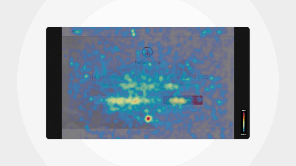
It feels like heatmaps were always a part of the core UX testing tools, but Hotjar’s website optimization tool launched less than a decade ago! When Hotjar launched in 2014, it was an affordable tool with a revolutionary user-friendly interface, which turned out to be a very attractive combination for researchers and businesses alike. Although heatmaps were only one of the many tools that they offered, its capabilities for visualizing user interactions such as clicks, scrolls, taps, and even move maps were clearly on display. On top of this, Hotjar’s platform showed that combining various different types of user feedback and data could be done easily for more informed design decisions. Since heatmaps established itself as the most dominant tool for visual representation of user behavior, it became an essential tool in the mix for UX design.
Heatmaps Today
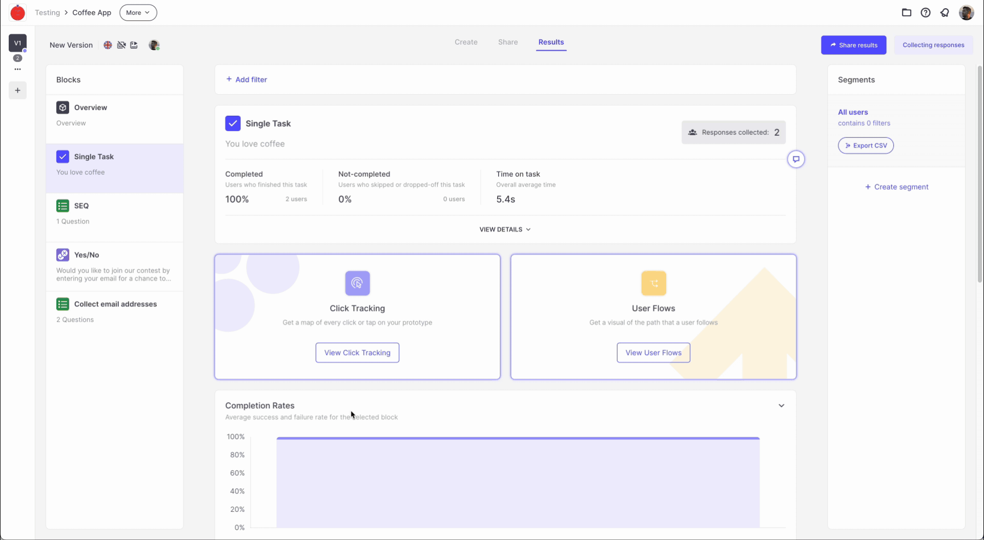
Currently, there are many brands that offer heatmaps in their UX testing platforms, and some simple analytics tools, such as “Clarity” offer heatmaps as stand-alone options. Of course, to get the best out of your heatmaps, better integration, and access to seamlessly integrated tools in one spot, we recommend taking advantage of Useberry’s website testing tool! You will have access to a wide variety of methods and the flexibility to integrate different methods together for relevant and stronger data collection. You will also be able to use special features such as Interactive Clicks to cover some of the weaknesses of the visual data that heatmaps provide, which we will discuss further down in this article.
Another benefit of Useberry is the ability to set a task and a scenario that the participants of a test should try to accomplish. This way, you will know the user’s goals beforehand and won’t have to do any guesswork to understand the rationale behind the interactions. For example, if you asked the users to go to a specific page that has a CTA designated for it on the main page in the form of a banner or a tile, but you see in the results that many users have chosen to go into the menu bar to explore sub-headers, you can immediately come to the conclusion that the CTA needs some adjustments to be more clear or visible.

Best Practices and Pitfalls
Heatmaps have evolved quite a lot within the last 2 decades, with expanded capabilities and better ways to visualize user behavior for insight and analysis. This also means that modern heatmaps come in various forms, and it is important to pick the right one for the job. This leads into our next subject, do’s and don’ts of heatmaps.
Defining Your Research Objective
It is important for you to start your research with a specific question you are trying to answer. Drowning yourself in data, and trying to get a meaning out of it will take a monumental effort and cost you valuable time and resources. Heatmaps can gather behavioral data on clicks, scrolls, taps, cursor movement, attention zones, and more.
If you are fishing for insights instead of setting a research goal from the beginning, you would have to go through a lot of data that is not relevant to you. For example, if you are a news site looking for the ideal word limit on your articles, scrolling data to capture the drop-off point on your pages would be the most relevant tool for you. You can filter out the data, such as clicks and taps, to save your team some time and have a clearer picture that is relevant for your objective.
Context of Use – Website vs Mobile Heatmaps
User behavior can vary drastically among different devices, and it is necessary to equip yourself with testing tools that can gather data on what is relevant to you. Keep in mind that there are differences in navigation patterns as well as expectations from the users. A website that is designed for a desktop view has a lot of space to work with and can clearly display menu bars, informative banners, and frames within a single screen, however, when it comes to mobile, the lack of space leads to many differences, such as collapsing menu bars, hamburger icons, or nested menus.
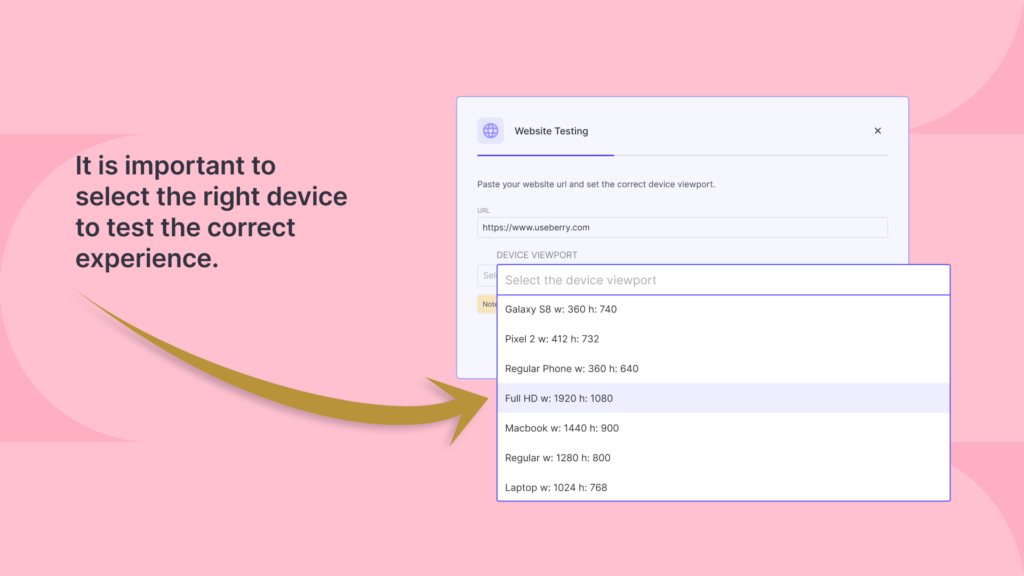
A mobile user might be very familiar and comfortable with vertical scrolling on the mobile device but if you apply the same style to a desktop layout, users might get frustrated with the lack of clearly displayed information on a single frame and the need for excessive scrolling. Mobile users understand that they might have to scroll to reach important or necessary information but it is expected to be displayed on landing for desktop design. It is important for you to run your tests on all devices that are relevant to your audiences to gather correct data on their behavior. With Useberry, you can pick exactly which device you want your test to run on for the most accurate results.
Avoiding Misleading Interpretations
Although Heatmaps is a great method for gathering user behavior data, we still have to analyze and interpret the results correctly to get actionable insights and make correct decisions. One of the most common mistakes is – always interpreting high click density as success. It is very important to understand the context of a click/attention density on a heatmap to realize if it was a problem area caused by something like confusion and bottlenecks or if there was genuine interest leading to high engagement.
One of the best solutions for this is to take advantage of other tools at your disposal during the testing process. For example, you can take advantage of Useberry’s Session Recording tool to review the high-density spots in question and observe if they were genuine engagement, accidental/random clicks, or the result of confusion. You can also isolate a specific area to explore and review in which order the clicks have occurred.
Taking Advantage of Integrated Tools
Heatmaps are a powerful weapon in the hands of UX designers and researchers, but relying solely on one tool would always be a limiting factor when we have such a wide variety of methods and tools available that are seamlessly integrated on platforms such as Useberry 3.0. Going back to the news site example we gave earlier, even after reviewing the scrolling heatmaps results and finding out drop-off points for scrolling, the site can benefit from running an A/B test with different font-sized articles to see if the users were dropping off after a certain amount of scrolling or certain minutes of reading.
Moreover, you can use Open Analytics, user surveys, or qualitative tests to get direct input from the study participants to see why they dropped off from the articles at certain points. Perhaps it had nothing to do with article length or scroll fatigue but an intrusive banner that appeared in the body of the article at a certain point on the page that turned off users. A recommendation in this case would be to readjust the banner placement for a better user experience instead of adjusting article length or scroll amount.
Technical Limitations and How to Overcome Them
Following up on the limitations of using a single tool, it is also important to understand the technical limitations of heatmaps as well. Over the years, heat maps became more and more powerful, expanded into mobile heatmaps to satisfy new user trends, and expanded capabilities to match the devices that they are gathering behavioral data on. However, websites and apps design have also become a lot more complex and sophisticated with a bigger emphasis on dynamic content. Websites can have many dynamic components on a single page such as constantly looping carousel banners, pages that react to user input(such as features that expand on click or hidden features that toggle on/off), chatbots, real-time notifications, pop-ups, etc.
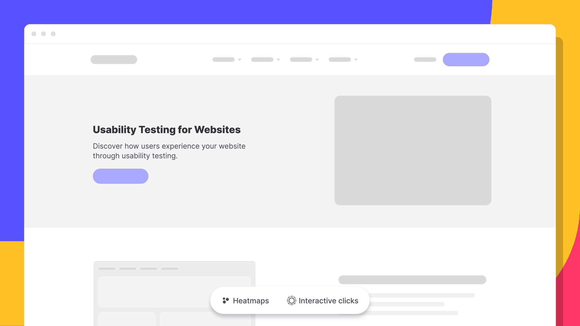
Heatmaps might struggle to accurately represent interactions with these dynamic components. If you would like to map accurate engagement on the dynamic components of your prototype, there is an easy solution – Interactive clicks!
Interactive Clicks will enable you to understand how your users engage with dynamic elements of your website. They will visually reveal precise clicks on every component of your website and cover the areas where heat maps come up short.
You can incorporate Interactive Clicks into your test to gain a deeper understanding of your users behavior and boost both the quantitative and qualitative data for better insights. For example, reviewing click tracking data of users on a task-based usability test reveals where users get confused or stuck while trying to complete the given tasks. To find out more about Interactive Clicks and how to best utilize it, you can read our detailed guide here.

Conclusion
Overall, the benefits of heatmaps in UX design and testing are clear, but it is important to remember that this is only one piece of the data puzzle. Relying on only one method, regardless of how strong it is, will leave you with many blind spots in your user behavior data. Heatmaps can have great synergy with methods such as click tracking and user flows in your test, and using them together will greatly improve your quantitative results. On the other hand, reviewing users’ faces, voices, and screens from video recordings can give you great qualitative data and lead to richer insights.
Understanding the strengths and weaknesses of each testing method available and how they fit into your test to satisfy your objective will lead to much better results.
Start your data visualization journey today!
To find out more about all the methods that we offer on Useberry’s platform for testing or to explore Heatmaps further: