Every click, scroll, and movement on your website tells a story. Heatmaps and interactive clicks are the click tracking tools that help you uncover that story, offering insights into how users interact with your site and helping you refine the user journey. The goal? To create a better user experience and improve usability by ensuring your website functions smoothly for your visitors.
Click Tracking
Before we go into heatmaps and interactive clicks, we need to understand “click tracking” as a whole. Click tracking is a powerful way to understand how users interact with your website or app. By recording users movements or clicks on elements like buttons, links, and images, click tracking paints a detailed picture of user behavior, revealing which areas attract attention and where users might face challenges.
Heatmaps and interactive clicks are two ways to visualize click tracking data, offering different but complementary perspectives. Heatmaps provide a bird’s-eye view of user engagement by highlighting areas of high and low interaction using color-coded(red to blue) overlays. On the other hand, interactive clicks drill down into the specifics, mapping out individual actions and clicks. Together, these tools provide a more complete picture, allowing you to refine designs and improve user experiences.
In short, click tracking is the foundation for understanding how users interact with your site, while heatmaps and interactive clicks are the lenses that bring this understanding into focus.
Understanding Heatmaps and Interactive Clicks
Every UX designer dreams of having clear, actionable insights into how users engage with their website; what captures attention, where confusion arises, and which elements guide users toward conversion. Heatmaps and interactive clicks make this possible by visually revealing user behavior. By tracking clicks, scrolls, and movements, these tools help you identify areas of high engagement and potential friction, ultimately guiding you toward improving usability. When used together, heatmaps and interactive clicks offer a full picture of how visitors engage with your website, from the moment they land on your homepage to when they complete an action or leave.

What Are Heatmaps?
Heatmaps are visual representations that use color-coded overlays to indicate user activity on a webpage. They map where users click, how far they scroll, and where they moved their mouse or finger. The “hotter” areas marked in red or orange show high engagement, while “colder” areas in blue or green reveal less activity. Heatmaps are incredibly useful for pinpointing where users are focusing their attention and where they might be missing key elements. These insights allow you to improve usability by adjusting your design to ensure better engagement and a smoother user journey.
Heatmaps emerged as a powerful tool, enabling designers to visualize and analyze user engagement, attention, and interactions on websites and applications. Since the adoption of heatmaps into the field of UX design and research, they have become invaluable for uncovering insights into user behavior. If you like what you read here, and would like a more in depth review of heatmaps, you should definitely check our utilizing heatmaps article as well.
Types of Heatmaps and Their Benefits
Heatmaps come in various forms, each serving a specific function for tracking user engagement. Depending on your goals, you can use these heatmaps to optimize different elements of your site.
Click Heatmaps
Click heatmaps highlight where users click most often on a webpage. They show high-activity areas like buttons, navigation menus, and images, which can help you determine whether key elements are easily accessible and engaging. For instance, if a CTA isn’t drawing clicks, you might need to adjust its design or positioning to improve user engagement.
Click heatmaps are particularly useful for e-commerce sites. They can reveal, for example, that users are clicking product images expecting more information when the images aren’t clickable. This can inform design changes to align with user expectations, improving overall usability.
Scroll Heatmaps
Scroll heatmaps provide insight into whether users are seeing important content by tracking how far down a page they scroll. If users are abandoning the page before reaching key information like a pricing table or signup form, it may indicate that the content above the fold isn’t engaging enough to encourage further exploration.
Scroll heatmaps are particularly useful for long-form content, where it’s essential to keep users engaged throughout the page. If readers stop scrolling halfway through, you may need to rethink the placement of important content or make the page more engaging.
Move Heatmaps
Move heatmaps track the movement of a user’s mouse or touch. While not every movement results in a click, this type of heatmap helps track attention and focus. By understanding where users pause or hover without clicking, you can infer where their attention is and whether certain elements on the page are confusing or unnoticed.
For example, if users hover over a filter option without interacting, you might need to make the filter more intuitive or draw clearer attention to it.
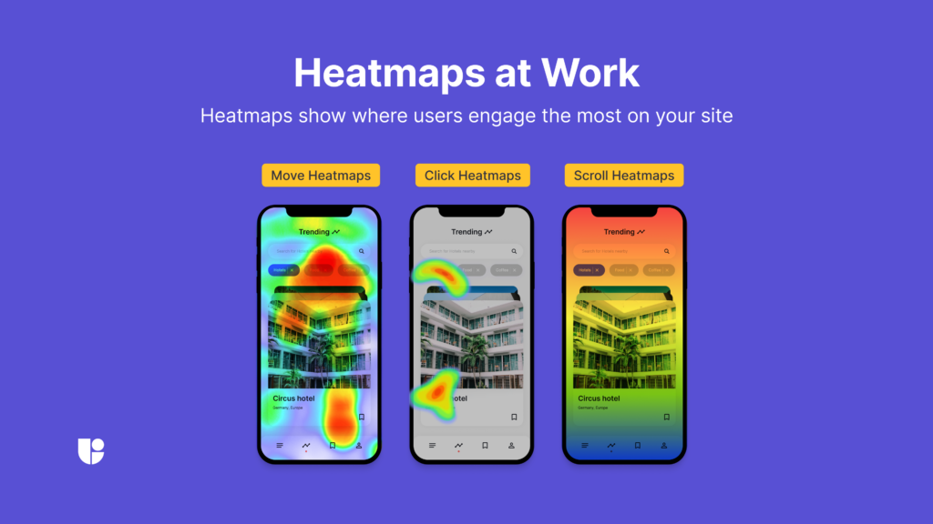
Optimizing Website Design Using Heatmaps
Heatmaps give you direct insights into how users engage with various elements of your site, providing the data you need to make strategic design changes. Once you know which parts of your page receive the most and least attention, you can optimize the layout to enhance usability.
For example, if a scroll heatmap shows that users aren’t reaching a vital CTA, consider moving it higher up the page to increase visibility. Similarly, click heatmaps may reveal underused navigation menus, suggesting that a redesign or repositioning could improve user engagement. Use these insights to ensure your site is both visually appealing and easy to navigate.
What is Interactive Clicks?
Interactive Clicks is a specific form of user interaction monitoring that maps out individual clicks across your website. While heatmaps provide a visual overview of where users focus, Interactive Clicks offers more precise data on specific interactions. Every time a user clicks on a button, link, image, or any other interactive element, click tracking records this action and records the exact location, time, and frequency of those clicks.
This tool not only reveals which elements are attracting attention but also provides a roadmap of the user’s entire journey on your site. It allows you to identify the paths your users take; where users start, what they engage with, and where they may encounter roadblocks. This insight is crucial for analyzing conversion funnels, identifying drop-off points, and measuring the success of CTAs. In short, it provides a detailed blueprint of how users move through your website, offering invaluable insights into both user intent and behavior.
Modern websites and apps often include a range of interactive elements, such as sliders, dropdown menus, and dynamic forms, which can complicate your analysis when reviewing results. These elements might not provide a complete picture of user behavior, as many interactions could be missed or misinterpreted by standard tracking tools. To overcome this, it’s essential to use an interactive clicks tool like Useberry’s, which captures data from these moving parts accurately. This allows you to gain deeper insights into how users engage with dynamic elements, ensuring your analysis is complete and helping you make more informed decisions. To know more about how to analyze your website using the interactive clicks tool, you can check our article on how to analyze your website with interactive clicks or watch the video below.
Benefits of Click Tracking
Click tracking is essential for providing detailed insights into how users interact with your site. Below are a few key benefits:
Identifying Popular Content
Click tracking reveals which elements on a page are receiving the most interaction. This is useful for understanding which content resonates with your audience and helps prioritize improvements. For instance, knowing which type of blog posts or product pages consistently receive clicks, will help you pinpoint the correct areas to optimize further. Identifying the “hot” and “cold” areas of your design will be instrumental on helping you decide where to place crucial information.
Understanding User Journeys
Click tracking helps visualize the paths users take through your site. By analyzing this data, you can identify common user flows and find any points where users are dropping off. This can reveal whether your navigation is clear and intuitive, and where you may need to simplify or improve your site structure. For an e-shop, good use of click tracking could have a direct impact on your bottom line by revealing pain points and increasing conversions.
Measuring Campaign Effectiveness
Click tracking is also invaluable for assessing how well digital campaigns perform. By tracking how many users click on specific CTAs, links, or banners tied to a campaign, you can gauge its success and identify any tweaks needed for better performance. We can easily combine these campaign data to gather insights about our product or website design.
For example, if you notice a really high click rate on a specific CTA or link but very low engagement or high bounce rate on the landing page, you can understand that the users were interested in the topic that you were presenting but didn’t like what they have found on the landing page. It is also possible that users misunderstood your CTA or other descriptive texts.
To zero in on the problem, it would be best to recrate the user journey on a UX study, and ask the participants to let you know why the confusion happens in questions following the task. If you need help crafting a UX study to fit this purpose, Useberry can help with a variety of ready-made professional study templates so you don’t have to build it from scratch. You can use one of our usability testing templates or feedback survey templates to get your UX study started.
Best Practices for Click Tracking
Setting Up Tracking Parameters
Start by defining clear objectives for your click tracking efforts. This means identifying the key elements of your site, such as CTAs, forms, or product pages that are crucial for conversions. For example, tracking clicks on a “Buy Now” button will provide specific insights into your e-commerce site’s performance, while monitoring clicks on informational links may help refine content strategy.
By focusing on the right metrics, you ensure that the data you collect is actionable and aligned with your website’s goals. For example, a SaaS website might track clicks on their “Free Trial” button. If clicks are low, it may indicate that the button isn’t prominent enough or that the offer itself needs adjustment. Even before click tracking was widely available, clever tricks like “read more” buttons were placed under each intro section to discover which content was best performing.
Monitoring User Interactions
Click tracking shouldn’t be a one-time setup. Regularly review the data, especially after major events like a website redesign, a product launch, or a new marketing campaign. This ongoing monitoring helps identify shifts in user behavior that could indicate usability issues. If you notice that users are clicking less on key buttons or links, this could signal a drop in engagement or interest in that area of your site.
Creating Goals and Conversion Paths
Use click tracking together with conversion path analysis to better understand how users are moving through your website. This allows you to map out the steps users take before taking a definitive action like making a purchase, subscribing to a newsletter, or completing any other conversion goals. Setting up clear paths helps identify whether users are following the expected journey or if they are dropping off at certain stages.
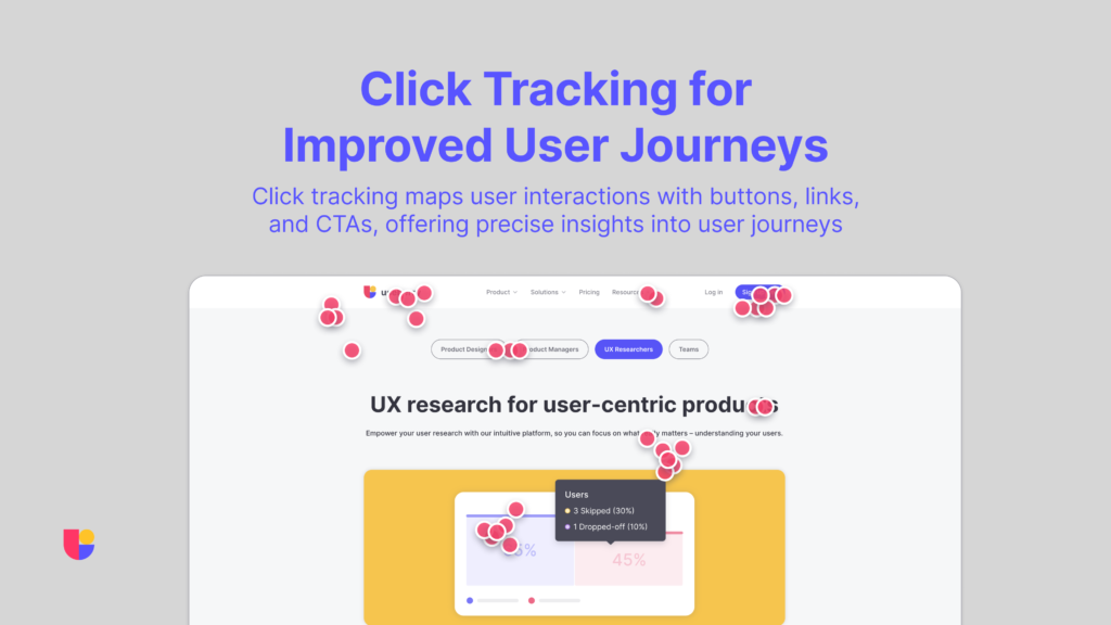
Combining Heatmaps and Interactive Clicks
To gain a comprehensive view of user interactions, combine Interactive clicks with heatmaps. While Interactive clicks helps you monitor specific elements, heatmaps provide broader context, showing areas of focus or neglect on a webpage. Together, these tools give you a more complete understanding of where users are engaging and where they might be encountering problems.
By using both results, you can develop a fuller profile of user engagement. Interactive clicks allows you to monitor specific actions, such as clicks on a CTA or link, while heatmaps highlight areas of focus and attention. This combination helps refine design choices and ensure optimal placement of key elements.
Informing A/B Testing with Combined Data
Heatmaps and interactive clicks also provide valuable data for A/B testing. Use the insights gathered to compare different versions of a page or design elements, such as CTA placement or headline choices. By understanding which version drives more clicks or encourages more scrolling, you can make data-driven decisions to improve usability.
Additionally, you can pair heatmaps and interactive clicks with usability tests, such as session recordings and user surveys, to further validate your design choices. Combining these methods ensures that you’re continuously optimizing your site to meet user expectations.

Conclusion
Heatmaps and interactive clicks are essential parts of click tracking for improving usability. By leveraging the insights they provide, you can optimize your website design, streamline the user journey, and create a seamless user experience. Whether you’re looking to improve conversions, reduce bounce rates, or simply enhance overall usability, these tools should be a key part of your UX strategy. And remember, combining these insights with other tests only strengthens the effectiveness of your design decisions.
Start Visualizing User Journeys Today!
To explore Click Tracking with Useberry further, click below.


