The Customer
Kapital Bank, a retail bank in Azerbaijan, boasts its digital presence with its mobile app, Birbank, which has accumulated over 5M downloads and retains 3M monthly active users. Recognizing the evolving digital landscape in 2021, they established a UX research team, dedicated to ensuring that their offerings align seamlessly with the preferences and needs of their users.
When initially equipped only with online survey tools for usability testing, Gunash Kamzaevi, Senior UX Researcher at Kapital Bank, recalls the initial challenges: “When I first joined, we were supposed to physically observe the respondents and make the best use of it. It just seemed unnecessary.”
Driven by a need for more efficient user research tools and a desire to minimize the observer effect, the team began their search. “I started searching for online usability testing tools and came across Useberry,” Gunash shares. Describing it as a platform that not only met their requirements but was also offered at “almost a fraction of the price” compared to other solutions. With Useberry’s integration capabilities and robust support, it wasn’t long before the platform was pitched and adopted, setting the stage for a new era of data-driven decision-making at Kapital Bank.
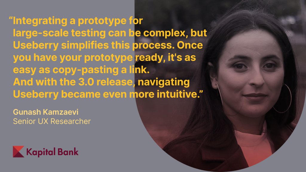
Useberry has not only simplified our usability testing process but has also significantly enhanced the depth and quality of our user research. Features like Screen Recording and Session Recording have been invaluable for unmoderated testing. Being able to observe how users interact with and navigate through our design without direct supervision has provided us with indispensable data.
Gunash Kamzaevi
The Task
The team aimed to add an advertisement banner to their app, to create a new sales channel for cash loans and credit cards. As Gunash Kamzaevi put it, “The designer crafted different banner versions. The primary research goal? Find out which banner attracts more attention and is more likely to be clicked on.”
The motivation for this new banner was clear. At the beginning of the year, Kapital Bank had pivoted towards promoting self-service, which led to a significantly large number of customers using the app more actively, thus creating a new opportunity for sales. Simultaneously, traditional advertising means like billboards and TV ads were witnessing a dip in effectiveness.
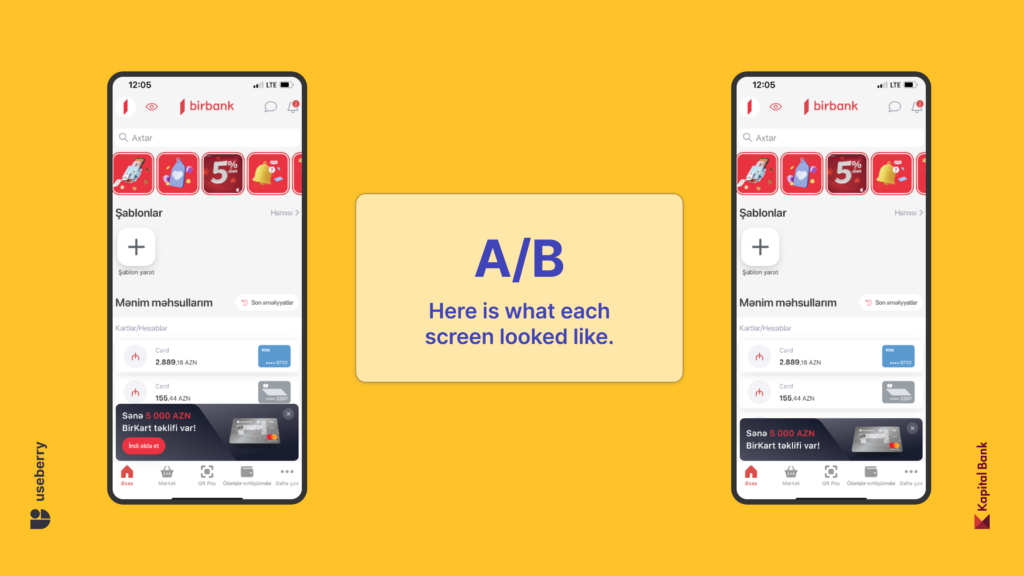
Three distinct banner designs were considered:
Option 1: A straightforward banner without a call-to-action or any instructive cues.
Option 2: A version with a distinct red button and a clear call-to-action, prompting the user with “Get it now.”
Option 3: Another variation with instructions but no highlighted button.
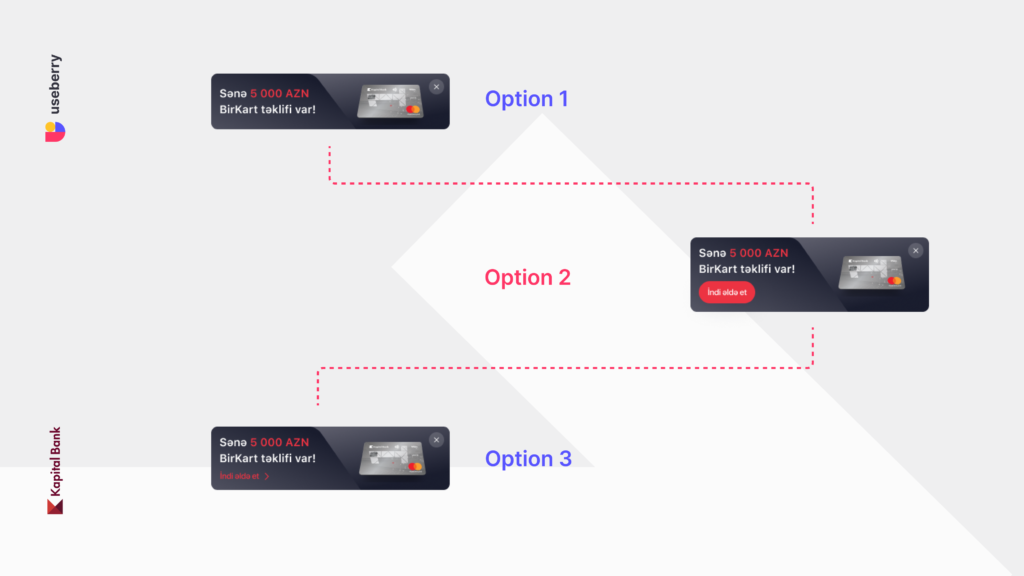
After discussing with the design team, the third version was dropped, since it was similar to the second but with fewer attention-grabbing elements. So, it came down to deciding between the first and the second design.
Given the app’s diverse personas, and over the course of research, it became clear that certain age groups are not as tech-savvy as others. Gunash emphasized, “As we decided to utilize Useberry, we had to consider this diversity”. The criteria further detailed:
- Age group: 18-45 years.
- Pre-approved for loans/credit cards.
- Active users in the past three months, ensuring they would notice the new banner.
- To achieve a 95% confidence interval and 7% ME, at least 196 respondents were needed. “Since each version is nominally independent of the other, I decided to run each test separately and then compare the results,” Gunash explains.
The banner’s positioning was strategic, appearing every time a user accessed the app. “The objective was to grab immediate and informed attention. So, I decided to run the study with a First Click test and follow-up questions,” says Gunash.
The Challenge
Navigating the fast-paced environment of Birbank in a fiercely competitive market meant always racing against the clock. For the team, diving into unmoderated testing with a large group was a new challenge. They weren’t sure if they could get enough participants for each test. Additionally, when users were directed to a Figma prototype that looked just like the real app, it raised some concerns, if they skipped through the context screens. Some users felt uneasy, thinking it might be a scam. “The last thing we wanted was complaints about scams to our Call Center. It was crucial to create a clear and easy-to-understand disclaimer,” Gunash explains.
The Solution
In addressing the challenge, the ‘Context Screen’ and ‘Welcome page’ of Useberry were critical. These tools allowed the creation of a straightforward disclaimer, ensuring respondents felt safe and well-informed. “By the time they began, they knew exactly what to expect, and this enhanced the quality of the data,” says Gunash.
After setting up a First Click task and adding follow-up questions, they sent out the links via push notifications. The response was swift, with 200 responses for each link with no effort at all within 48 hours, something Gunash describes as “a dream come true for a UX researcher.”
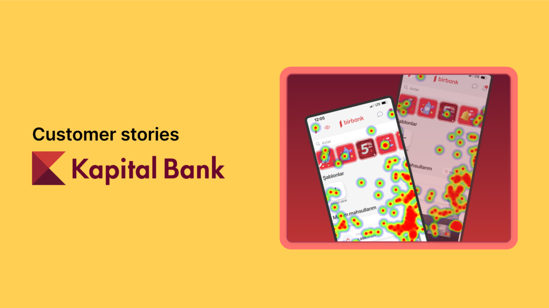
Once the responses were collected, the data analysis began. Useberry offered metrics like heatmaps, time spent on each page, and responses to follow-up questions. While both banners had comparable results, significant variations were seen in the time users spent on each page and their heatmap patterns.
“In version B, we noticed random clicks at the bottom center of the screen where people might’ve conditionally or unconditionally touched with their thumbs when opening the prototype. But in version A, we observed more oriented clicks. So, it’s not just about how many times people click, but where they’re clicking,” Gunash points out.
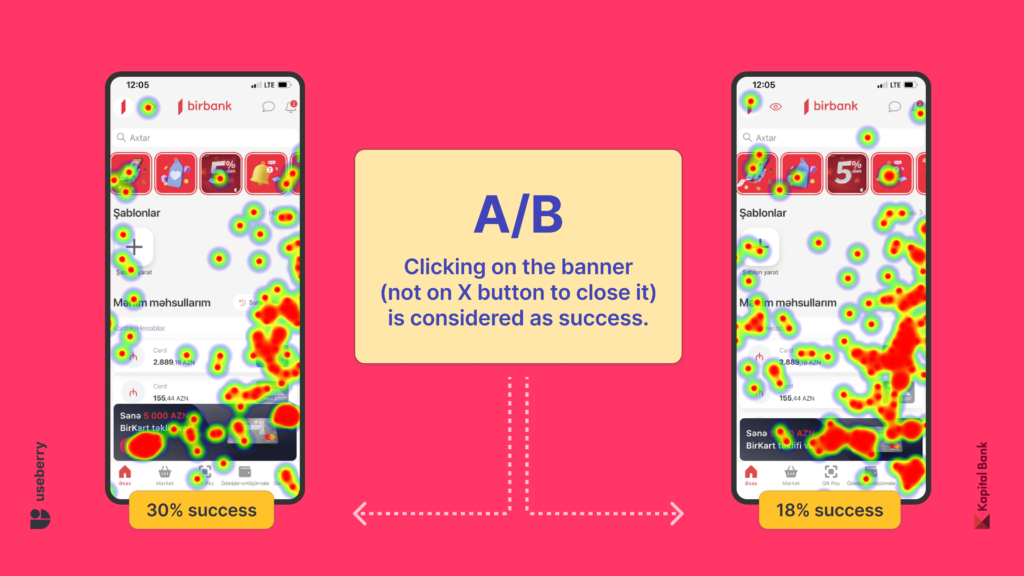
In an initial test phase where two banners were presented to a group of customers, the data was clear: 30% success rate for the banner with a button, as opposed to 18% for its counterpart. “This difference was significant enough for us to make a decision,” Gunash explains.
“There are a lot of features at Useberry that I enjoy. The opportunity to receive quick results, being able to observe the results as they unfold in real-time, analyzing the heatmaps and clicks from different perspectives, and the flexibility of conducting multiple usability testing at the same time are some of my favorites.” – Gunash Kamzaevi
The Results
Kapital Bank’s pursuit of the right banner was data-led. Following their discovery, the team conducted a live A/B test with both banners, to confirm their initial findings. The conversion rates, defined by the number of users who clicked on the banner and then proceeded to order the displayed product, were telling: a 3% conversion for one and a whopping 21% for the other. To put it in numbers, 24,213 of the 115,301 users clicked and proceeded to purchase.
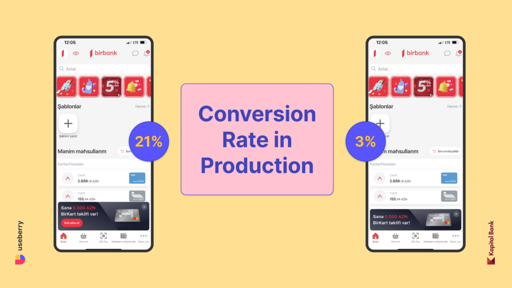
The standout 21% banner was not just a preference, but a data-backed choice, showcasing the value of Useberry’s insights. This significant 7x leap in conversion wasn’t just a numerical triumph. It was a testament to Kapital Bank’s commitment to informed decision-making.
Feel free to contact us!
Ready to learn more about how Useberry can streamline your UX research process? Connect with our experts today and let’s explore the possibilities together.