
The UX Industry is firmly based in the tech sector and revolves around design and development, so it is constantly evolving and growing because of its innovative nature. Every year, new terms and trends pop up. It can be hard, even for someone who is in the industry, to keep up. Super apps, touch-free interactions, neumorphism, AR interactions, gestural interfaces, and neurodesign are just a few of the new terms that have become popular in recent years. Then there are more advanced terms like lo-fi vs. high fidelity, persona spectrums, cognitive load, Skeuomorphism vs. Flat Design, etc., and it is hard to keep up with all of them.
You can find some glossaries online that list hundreds of terms, trying to give the definitions for every term in the UX industry they can find, but this makes it harder to grasp the significance of each term. In this article, let’s take a look at some of the most important terms and delve a bit deeper into their importance in the context of UX Design.
Foundational Terms in UX Design
A solid understanding of foundational terms lays the groundwork for crafting meaningful user experiences. These basic terms serve as tools for effective communication and help us align our efforts toward common goals. Whether you’re new to the field or looking to refresh your knowledge, these basic terms form the essential toolkit for your journey into the dynamic realm of UX Design.
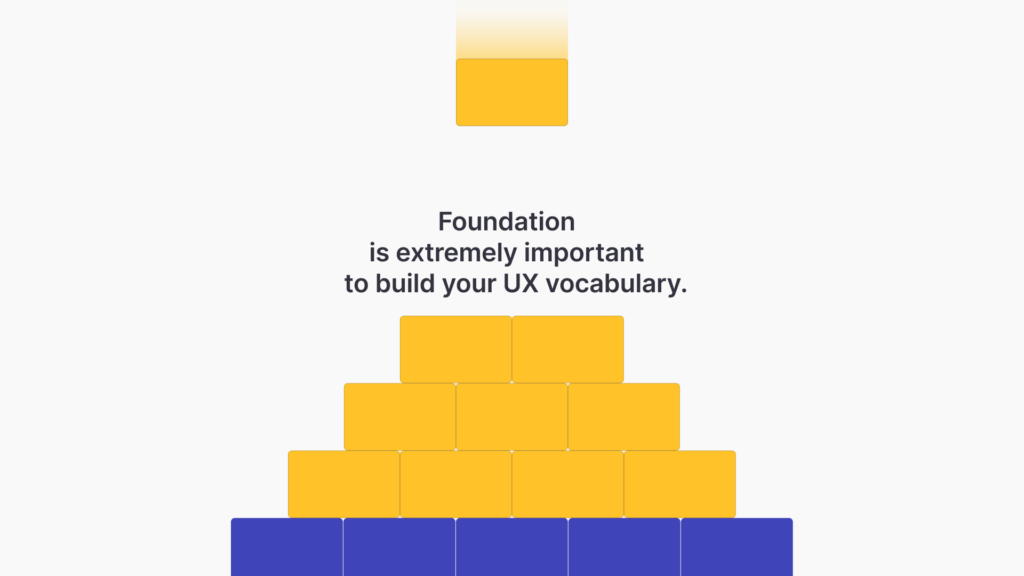
Let’s use the following terms for a strong start!
1. User Interface
The user interface (UI) encompasses the visual and interactive elements of a product that users engage with. It includes buttons, menus, forms, and other elements that enable user interaction. A well-designed user interface encourages engagement and interaction, contributing to positive user experiences and achieving business goals.
2. User-Friendly
A design that is user-friendly is intuitive, easy to understand, and comfortable to use. It balances the amount of information shown at any given time and provides a smooth user experience. User-friendliness leads to intuitive designs that promote user adoption and loyalty.
3. Feedback
Feedback involves collecting input from users about their experiences with a product. It helps designers refine and improve the design based on real user insights. Gathering feedback from users guides design improvements and refinements, aligning the product more closely with user needs and expectations.
4. Heuristics
Heuristics, although sounding very “advanced”, is actually a very simple term, referring to a set of general guidelines or principles that serve as a framework for evaluating the user experience of a product or interface. These heuristics are derived from established best practices, research findings, and the accumulated knowledge of UX professionals.
The term “heuristic” comes from the field of psychology and refers to a mental shortcut or rule of thumb that helps individuals solve problems quickly and efficiently. If you are interested in learning more about the subject, taking a look at Nielson’s “10 Usability Heuristics for User Interface Design“ article would be a great start!
5. Usability
Usability is a foundational concept in UX design, ensuring that products are not just aesthetically pleasing but also functional and easy to use. It emphasizes the importance of crafting experiences that are easy to navigate, understand, and interact with. A product’s usability has a huge impact on user satisfaction, retention, and overall success! Since it is a broad concept, usability is usually broken down to a set of goals for testing that usually include:
- Learnability – New users should be able to understand the product’s basic functionality and start using it effectively with minimal effort.
- Satisfaction – Users should have a positive and enjoyable experience when interacting with the product.
- Memorability – Users should be able to easily remember how to use the product even after a period of inactivity.
- Errors – The design should help users avoid mistakes, and when errors do occur, they should be easy to recover from.
- Utility -The product must offer the right kind of functionality for users to be able to complete their tasks.
- Efficiency – In usability, it refers to the ability of users to accomplish their tasks quickly and with minimal steps. We will look at efficiency in a broader sense later in this article.
Navigation and IA Terms in UX Design
In the field of User Experience (UX) design, few elements hold as much weight as the user’s navigation experience. Imagine embarking on a journey without clear direction or a reliable map. Just as in the physical world, the digital realm demands well-crafted pathways that guide users through a seamless and intuitive exploration to provide the best experience.
In this section, we explore terms that focus on navigation and information architecture (IA), uncovering how they serve as the compass guiding users through the digital wilderness. From breadcrumbs that provide a clear path to tree testing that evaluates navigational efficiency, these terms underscore the critical role that intuitive navigation plays in shaping user satisfaction and the success of digital products.
6. Breadcrumbs
Breadcrumbs are a navigation aid that displays the user’s current location within a website’s or application’s hierarchy. They provide a trail of links that helps users understand where they are and how they got there.
Breadcrumbs offer users a clear sense of their location within a site’s structure. This aids in navigation, preventing users from feeling lost and frustrated while encouraging exploration.
7. Microcopy
Microcopy consists of small, concise pieces of text that guide users through an interface or assist them in completing tasks. It plays a crucial role in providing clarity, context, and guidance to users. Thoughtful microcopy provides clarity and guidance during interactions, reducing user confusion and minimizing errors. It contributes to a smoother user journey.
Microcopies can be very helpful to the user journey, but if you are unfamiliar with them and would like to collect feedback on your microcopies, you can take advantage of one of Useberry’s UX testing templates to get right into it. In this case, a Preference Testing template would be the best fit! If you are interested in finding out more, we also have a guide on Preference Testing that will tell you everything you need to know about the method.
8. Information Architecture
Information architecture focuses on structuring and organizing content to enhance usability. A well-organized information architecture improves findability and navigation, enhancing the user’s ability to locate content efficiently.
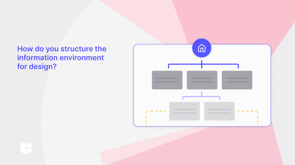
Let’s take a look at the most common testing techniques for IA below:
- Card Sorting is a user experience research technique used to gather insights about how users categorize and organize information. Participants sort content into groups and label those groups, helping designers understand users’ mental models. Card sorting insights help designers create navigation structures that align with users’ mental models, leading to more intuitive layouts and improved user satisfaction.
- Tree testing involves evaluating the effectiveness of a site’s navigation by asking users to find specific items in a predefined hierarchy. Tree testing validates the navigation’s effectiveness, ensuring a seamless user experience.
Although these two methods are a major part of IA testing, they are not interchangeable. Card Sorting is very effective to grasp how the users think about and organize your content, Tree Testing is useful for validating that the way you structured your information (content) is easy to understand. You can find out more about these methods on our website, or even try both the Information Architecture testing demos!
Design Visualization Terms in UX Design
Transitioning ideas and concepts into reality is a journey. There are many steps we need to take in between before we end up with the final product. This journey might involve many stakeholders who would like to be able to peer into the abstract and share in your vision, as well as evaluate and iterate upon it. As your ideas transform into tangible designs, wireframes, mockups, and prototypes are used to visualize the current stage that they are in. We will explore the distinct roles these three terms play in visualization and why they are important for the UX design process.
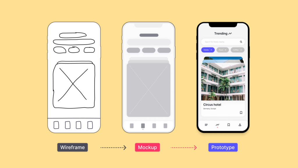
9. Wireframes
Wireframes are basic sketches or diagrams that outline the layout and structure of a user interface. They focus on content placement and hierarchy, providing a blueprint for design. Wireframes establish the foundation for design layout and hierarchy, facilitating early feedback and minimizing design changes during more advanced stages.
10. Mockup
A mockup is a static representation or visual draft of a design. It helps stakeholders and designers visualize the layout, structure, and aesthetics of a product before moving on to the more detailed stages of development. Mockups give stakeholders and designers a tangible visualization of the design’s aesthetics and layout, fostering alignment and informed decision-making before investing in further development.
11. Prototype
A prototype is a functional model of a design that simulates user interactions and experiences. It helps designers and stakeholders validate concepts and gather feedback before development. Prototypes allow for early validation and iteration, reducing the risk of costly design errors later in the development process and resulting in a more refined final product. A prototype can be static or interactive, as well as low-fidelity or high-fidelity, depending on what you are looking to present or test.
Not all prototypes resemble the final product. A low-fidelity prototype might look nothing like the final product, but it will be easier to create and will allow your team to explore ideas and test the information architecture on a low-cost basis. A high-fidelity prototype, on the other hand, will look much closer to a final product and would be ideal for presenting to stakeholders or testing how users might interact with the final design.
As you go further into UX Design, you will hear the word “prototype” more and more since it is at this stage of the design when we have a functional model that we get the most out of user testing and gain the richest insights. Figma is one of the most popular design tools and is where many prototypes are formed. At Useberry, we strive to provide a cutting-edge testing experience and have worked hard to make our new platform compatible with the newest Figma features. Useberry 3.0 made groundbreaking advances to have enhanced capabilities while running Figma prototype tests. Of course, Figma is not the only integration that Useberry has worked on. Feel free to check out all the powerful Useberry Design and Prototyping Integrations.
Design Principle Terms in UX Design
Design is more than aesthetics; it also involves a set of principles that help develop memorable user experiences and pave the path to creating meaningful and impactful interfaces. Affordance, Data-Driven Design, User-Centric Design, Effectiveness, and Efficiency are some of the core principles that guide our design decisions. These principles steer us towards intuitive interactions, empower data-backed innovation, place users at the heart of our designs, and strike the balance between functionality and resource optimization.
12. Affordance
Affordances refer to attributes in design elements that allow people to understand how an object or element should be interacted with. For instance, a button’s raised appearance affords clicking, while a slider’s horizontal orientation affords dragging.
Understanding affordances is vital, as they guide users on how to interact with elements. Effective affordances enhance usability and reduce confusion, leading to a more intuitive user experience.
13. Data-Driven Design
Data-driven design involves making design decisions based on empirical data and insights gathered from user behavior and preferences. This approach ensures that design choices are backed by evidence and have a higher likelihood of resonating with users. For UX design, one of the most popular methods for collecting such data is Online Surveys. With Useberry’s Online Surveys, you can set up both qualitative and quantitative studies and gather the relevant data that you need.
Data-driven design ensures that design decisions are grounded in user behavior, preferences, and needs, enhancing the likelihood of creating solutions that resonate with the target audience.
Looking from outside the industry, when you hear the term “data”, it might sound like we are taking the “human” out of the decision process. Keep in mind that in the context of UX design, when we mean “data-driven,” we are referring to user behavior data. This leads us into our next principle – user-centric design.
14. User-Centric Design
User-centric design places the user’s needs, preferences, and behaviors at the forefront of the design process. It involves empathizing with users, understanding their context, and creating solutions that cater to their requirements. Prioritizing users ensures that design solutions address real pain points and fulfill genuine needs, increasing user satisfaction and loyalty.
Although there is evaluation involved in both data-driven and user-centric designs, data-driven design might not always take user needs into consideration. While user-centric design always does so as a principle
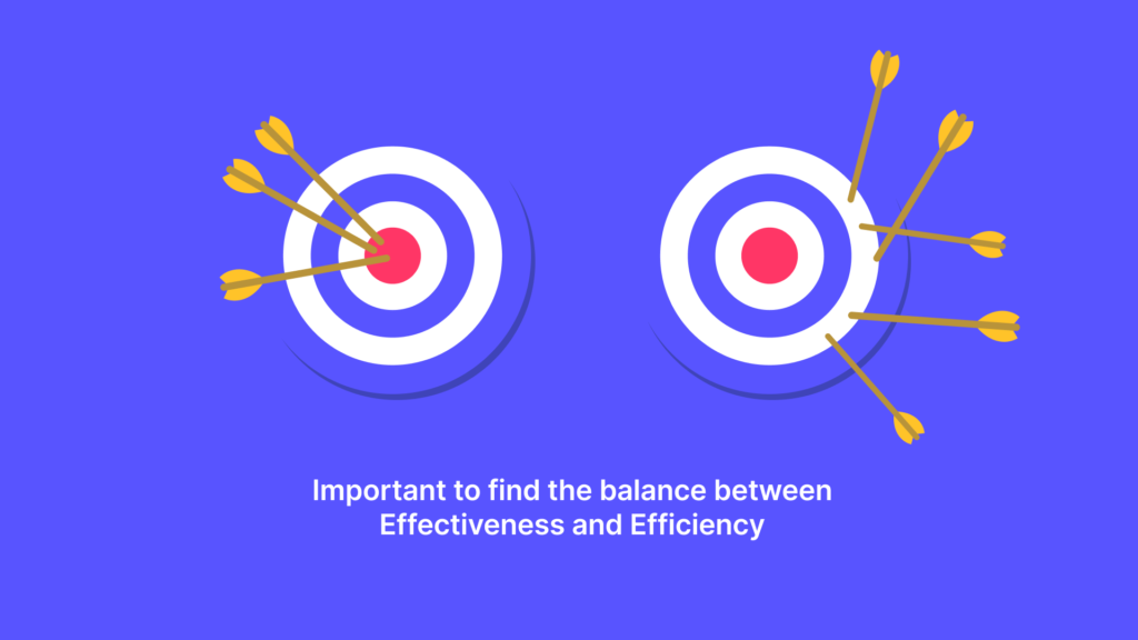
15. Effectiveness and Efficiency
Effectiveness refers to the extent to which a design achieves its intended goals, while efficiency measures the resources expended in achieving those goals. Both are essential metrics for evaluating UX success. Striving for high effectiveness = meeting goals and efficiency = using resources optimally ensures a balance between user satisfaction and resource utilization. Without these checks and balances, you might end up with a project that never materializes due to running out of resources and unmanageable goals.
Development & Process Terms in UX Design
Of course, we can not go from concept to completion without development! It is in the engine room of UX where sprints accelerate innovation, minimum viable products (MVPs) evolve into polished solutions, and constraints inspire ingenious design strategies. This is where meeting user needs and designing the best experiences intersect with real-world limitations and fuse together to shape the final product.
16. Sprints
Sprints are time-bound, focused design and development cycles. In a cycle, the development team, including UX, works on user stories (a small, self-contained unit of development work designed to accomplish a specific goal within a product) and tasks. A sprint usually lasts between two to six weeks. It involves rapidly forming ideas, prototyping, and testing to achieve tangible results within a short timeframe. Sprints provide a structured framework for rapid ideation and testing, promoting collaboration and efficient problem-solving, leading to quicker iteration and innovation.
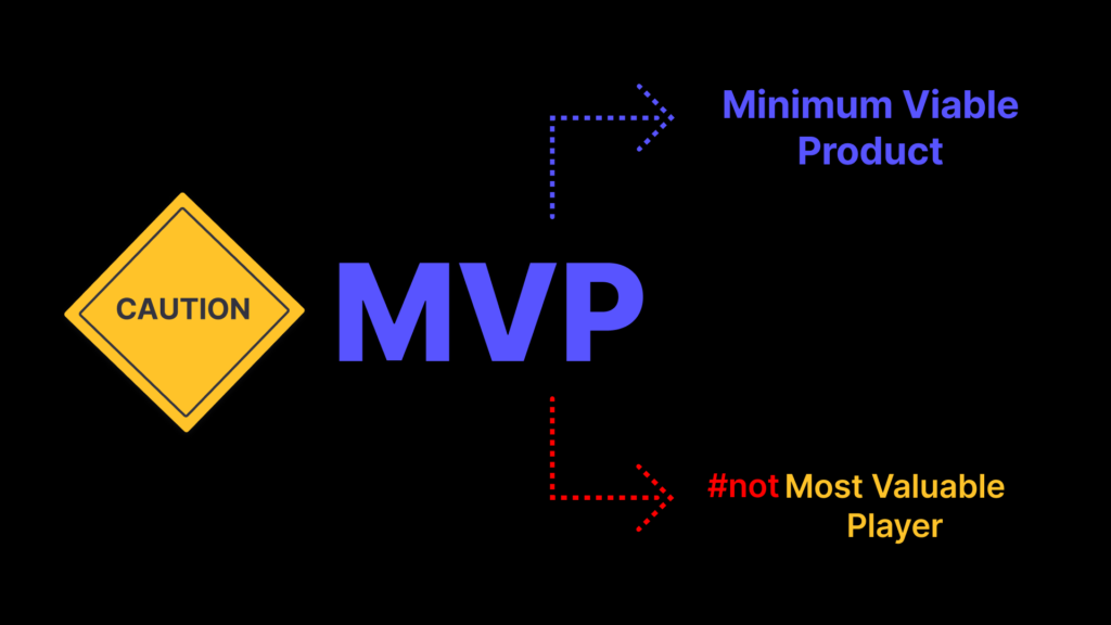
17. MVP (Minimum Viable Product)
An MVP is the most basic version of a product that contains only the essential features needed to meet the core needs of early users. It allows for rapid testing and iteration while minimizing development time and resources. Building an MVP allows for swift testing of core concepts with real users. At Useberry, we understand the importance of testing with real users, which is why we have a large, vetted, and verified Participant Pool of consumers and professionals to choose from for your studies that can match any targeting needs. This approach helps identify valuable features, streamlining development and avoiding unnecessary work.
18. Constraints
Constraints are limitations or restrictions that influence design decisions. They can be technical, time-related, or resource-related and play a role in shaping the design direction. Working within constraints ensures that design solutions are feasible, align with project goals, and are achievable within given limitations.
User Research Terms In UX Design
At the center of every remarkable UX design lies a deep understanding of the people who will interact with it. User research is the soul of the design process. It sheds light on the needs, behaviors, and preferences that guide our creative endeavors to shape these interactions. Data gathered with user research is analyzed and interpreted to become user insights. These insights are applied to our designs to transform them into meaningful experiences.
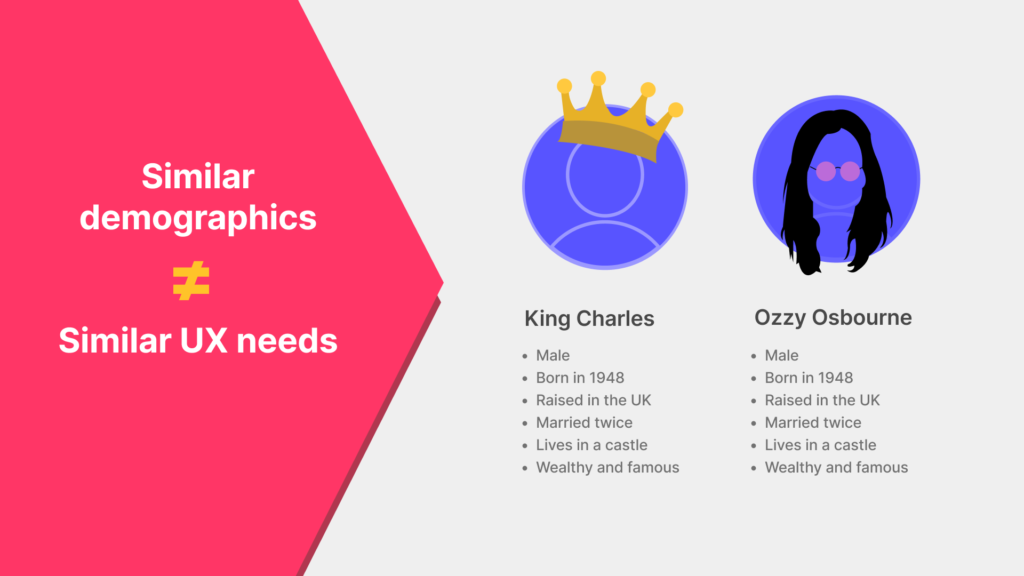
19. Persona
A persona is a fictional representation of a user group. It encapsulates their characteristics, behaviors, goals, and needs, aiding in designing for specific user segments. Personas humanize the user base, enabling designers to design for specific user needs and goals. This results in more relevant and impactful user experiences.
At this point, I have to bring up the famous meme of Prince (now King) Charles and Ozzy Osbourne. It demonstrates how Personas are about the user needs and challenges people face and not about user demographics!
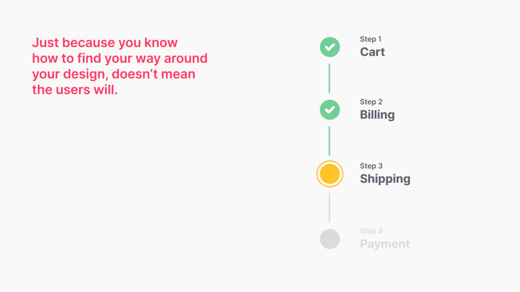
20. User Flows
A user flow outlines the steps a user takes to complete a task within a digital product. It visualizes the user’s journey, helping designers identify pain points and optimize the user experience. Visualizing user flows helps pinpoint bottlenecks and confusion points, enabling designers to optimize the journey and provide a seamless experience. Keep in mind that User Flows ≠ User Journey. A User’s journey is a holistic, high-level experience. However, User Flows focus on a specific set of discrete interactions that make up common user paths taken through the product.
Since User Flows are best experienced visually, it is only appropriate to present you with a visual explanation of how it work on the new Useberry 3.0 platform below:
21. Verification
Verification in UX involves assessing whether a design solution meets specified criteria and requirements. It’s a crucial step to ensure that the final product aligns with the intended user experience. Verification confirms that the design solution meets its intended goals and user expectations, ensuring a successful and reliable product. There are 2 main types of verification you will be using for evaluating your product throughout the design process.
- Formative Evaluation should be used at every step of the design process. It is used to get a better idea of what is specifically working or not working within your design. Learning what part of your design is not working well during the process helps you go back and rework it to have a better user experience. Testing frequently for formative evaluation during the design process will lead to a better product in the end. Luckily, it requires very few users to test (around five).
- Summative Evaluation is usually done after you have a complete product. It is used to see how well your design performs compared to a previous version or a competitor. Users grade their experience with the product on a predetermined scale, and the results are used to measure the success of your product. When testing for this type of evaluation, a large sample size that represents the intended users is necessary to have good results.
Conclusion
It was difficult to limit the number of terms to include in this list, but we had to stop somewhere! Hopefully, this list will serve as an introductory guide for the journey through the UX industry. The landscape will continue to evolve, but these terms will remain a solid foundation for your vocabulary. While we covered the essentials here, it is just the beginning of UX Design terms. We will continue to venture deeper into the exciting world of UX Design! We might look at the advanced terms in our next blog, or explore the newest emerging trends in the field. In the meantime, if you liked this article, perhaps you might want to take a look at our previous blog post on Top UX Trends. Stay connected to find out!
Tell us what you think!
Was this article helpful? What other terms or concepts would like to see on the next list? Let us know: