Just recently, we fully revamped our company blog into what I would call, an “aesthetically usable online journal”. It had been a few years since there were substantial changes and the time had come to rejuvenate it, as Useberry’s brand and our audience progressed.
Main reasons/goals for our blog redesign:
- Useberry brand – As the brand evolves, our target was that the blog’s new look and feel would resonate with its personality of Vivid, Playful, Intuitive, and Informative.
- Usability – Seamless user experience and pleasure provided when interacting with our blog, alongside UX trend utilization.
- Visual Appeal – Aesthetically pleasing design to enhance desirability.
Our main goal was to combine usability and desirability
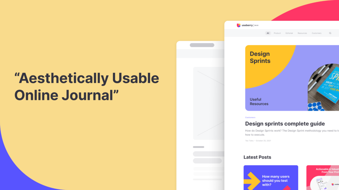
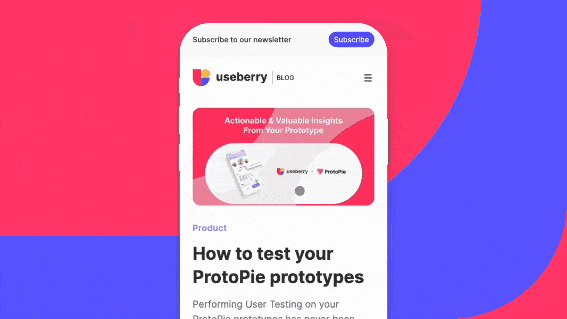
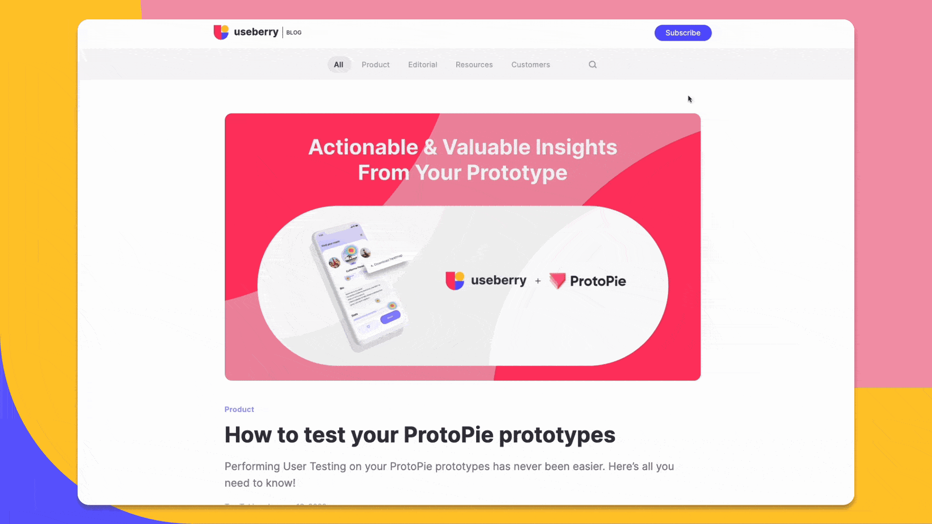
Here’s a look at the old and new Useberry blog homepage:
Are you thinking about redesigning your brand’s blog? This post shares our process and 5 principles that we’ve incorporated into our new design.
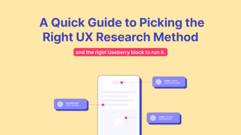
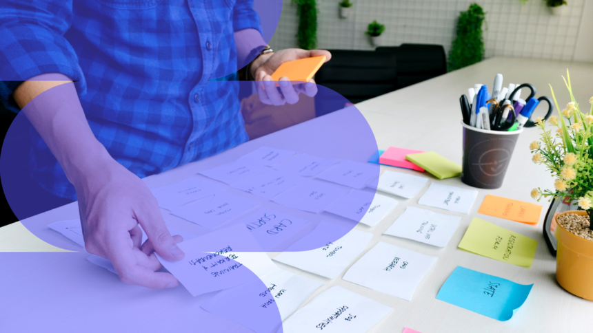
How Card Sorting helped us organize our content
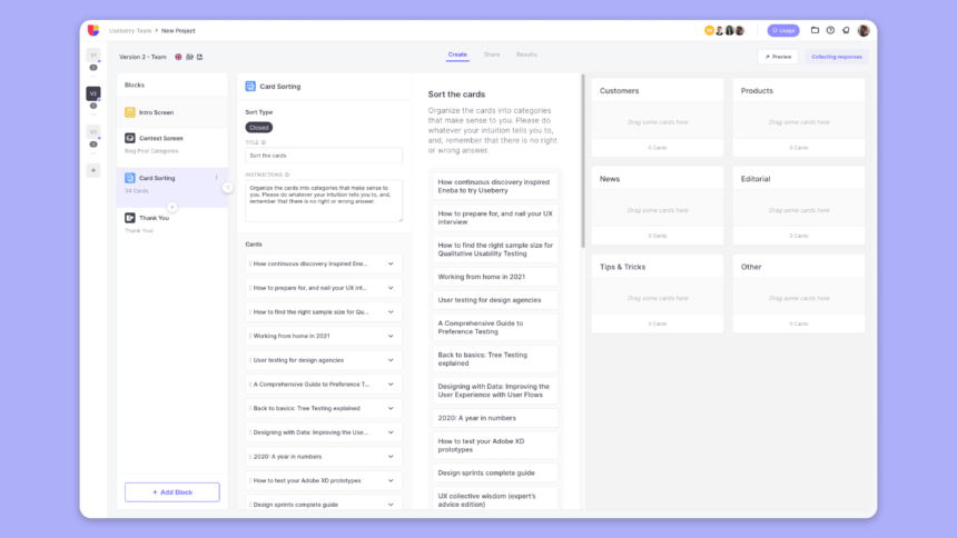
Redesigning your blog also means that you will probably be re-sorting your content to match the new design, re-evaluating your categories per the strategy, and optimizing your structure. In our case, as we had not previously categorized our articles, our task was to find out how our content would be placed so that it would match the new format and strategy. To accomplish this task we used Useberry’s card sorting research method.
Card sorting is used to evaluate or design the Information Architecture (IA) of a website. It’s all about discovering how people understand and group different concepts and improving an existing or new design.
For example, it can be used when you are:
- Developing a new website or app.
- Creating a new section on your website.
- Redesigning a section or even your whole website.
Useberry offers two (2) card sorting options
- Closed card sorting: Users sort the cards into fixed categories with predefined names.
- Open card sorting: Users create the categories themselves and sort the provided cards into them.
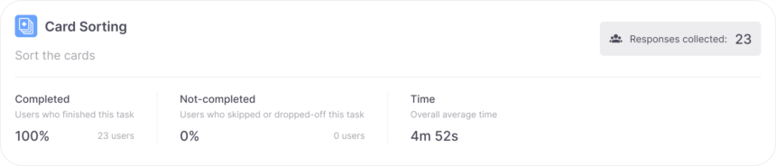
We used the ‘Closed card sorting’ method since we wanted to find out where each blog article would be placed in the category names we had predefined. We conducted the test with a total of 23 users and asked them to sort the blog post titles into the categories they would expect to find them under.
Card Sorting Results
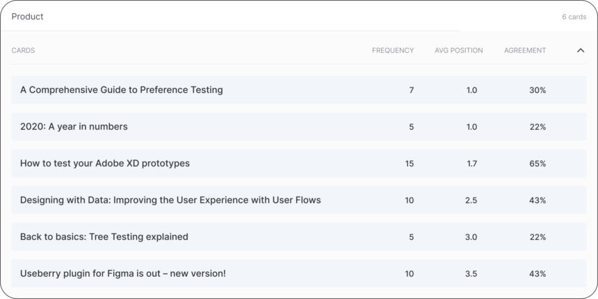
The result from a card sort is an overview of the overarching patterns seen during the sessions. We created several test versions with different category names until the ‘Agreement’ rate reached a satisfactory level. It showed us where the cards most often belong, helping quickly simplify our task.
Agreement = frequency/total users
The % of users that placed a card in the same category.
(1/23)*100=4.3%
(23/23)*100=100%
For example, as seen in the image below, 65% of 23 users placed the “How to test your Adobe XD prototypes” card in the “Product” category.
5 principles we incorporated into the new blog redesign
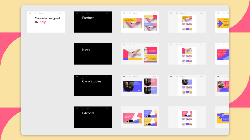
1. Highly visual content design
We kept a minimal and clean user interface (UI) adding a twist with vivid illustrations to draw and retain user interest. A series of templates were created to portray our exciting, upbeat, and UX research-based brand image. Taking into consideration our content strategy and graphic components that define Useberry’s identity, our templates have integrated shapes, color variations, typography sizes, and geometric patterns to emphasize our blog’s image.
2. Clear conversion goals
The blog’s primary purpose has always been to provide thought leadership, knowledge, and inspiration to our target audience. It’s critical that our content stands on its own, and that we never prioritize conversion over this main goal. At the same time, we wanted the blog to assist us in achieving measurable objectives. Adding elements to our blog to convert visitors into customers was kept subtle so as to not get in the way of the reader’s experience.
We set three key conversion targets for our blog redesign:
- Native banners that match the look, feel, and function of our blog to generate leads.
- Clear subscription form to enhance our opt-in email list.
- Footer banners for an easy flow to the main website.
3. Great mobile experience
Our blog redesign included a user experience (UX) that reflects a mobile mindset.
- Comfortable reading experience with around 30-40 characters per line.
- Easy on the eyes with big font sizes and color combinations – let’s avoid squinting, shall we?
- And of course, a responsive design.
4. Fast page load
Fast-loading pages mean happier visitors. Moreover, speed helps with SEO rankings and contributes to higher conversion rates.
We maintain a good page load time by:
- Loading only 6 articles at a time on each page so as to optimize performance.
- Fast media upload with resized and compressed media.
Load lighter, load fewer, and load faster.
5. Quick Find
A good user experience provides that users can quickly discover content that is of interest to them. We added a search box that allows users to narrow down the results based on the keyword or phrase they’re looking for. It allows users to reduce their selections without having to guess or perform a lot of filtering and browsing.
How can I test my blog for usability and design-related issues?
Whether you are in the first stages of creating prototypes, or you already have a blog up and running, you can find out what works and get back actionable feedback to make the right decisions and adjustments.
For prototypes: Capture user insights for your prototypes and collect feedback in minutes.
Import your prototype from your favorite design tool here.
For live websites: Discover how users experience your website through usability testing.
Test any website page you want here.
Conclusion
We covered the procedure of how card sorting benefited our content categorization task and the main design principles that were established. Our blog redesign aimed at bringing Useberry’s brand into unity with how we envision the future of its structure and image. As designing is an ongoing process – this journey will continue to grow and advance in the future.
Feel free to contact us!
We’d love to know your experience with Useberry and we will be excited to hear your thoughts and ideas.