Have you ever wondered which pages people look at once they have landed on your site? How do they navigate? The same questions go for designing a new digital product. How do people click through your prototype? How do they navigate and interact with the designed solution?
If you are conducting a UX study, you can turn to Useberry for answers!
In this post, I want to show you a very cool feature called User Flow.
With Useberry’s User Flow report you can learn about the path a visitor takes before reaching its destination while you are in the prototype phase of the design.
But, first things first.
What is User Flow?
User Flow visualizes the path a user follows from one screen to the next. It helps you understand the behavior of your users, and how they interact with your prototype and create a conversion funnel for it.
In other words, it is a graphical representation of which screens users utilize to complete a specific task, how they move around your prototype, and, most importantly, which screens they’re on when they decide to leave.
Let’s say a user lands on the “Home” screen, goes to the “About” screen, and then to “Contact Us” before leaving.
The user path would then be Home -> About -> Contact Us.
Why is this important?
The User Flow report can indicate specific points where testers remained longer or got stuck perhaps and help you make changes to enhance the user experience. The easier testers can navigate through your prototype and complete your task, the happier visitors to your final product will become.
Gaining a deeper understanding of how testers are interacting with your prototype can help you optimize your screens for maximum conversions.
This means that you’ll be able to see if there are any specific screens that made users leave your test/prototype. Once these screens have been recognized and then altered with more appropriate or engaging content, you can go back to the User Flow report to check if the number of drop-offs has declined.
You know what you want and like, but to be effective in the UX industry you need to understand the desires of your prospective users.
Understanding the preferences of your target audience is the first step in optimizing your design for conversions. Your aim is to make it easy for your target audience to find and purchase your products and services.
Here are just a few of the user behaviors you can learn about with the User Flow report:
- Which paths do your testers favor?
- Which screens have the highest drop-off rate?
What do they look like?
If you are familiar with the Google Analytics User Flows then you have an idea of how complex (or simple) a User Flow might look.
How to use User Flow Report in Useberry
Now that you know what User Flow is and why it’s important, let’s see how you can find and use the report in Useberry and in your designs.
The best way to explain something is with an example.
So, let’s create a simple prototype of a music app and monitor how our potential users interact with/navigate through it in order to complete a simple task.
In the following example, we have a “simple” scenario.
We asked 10 testers to “Add a track to their wish list”.
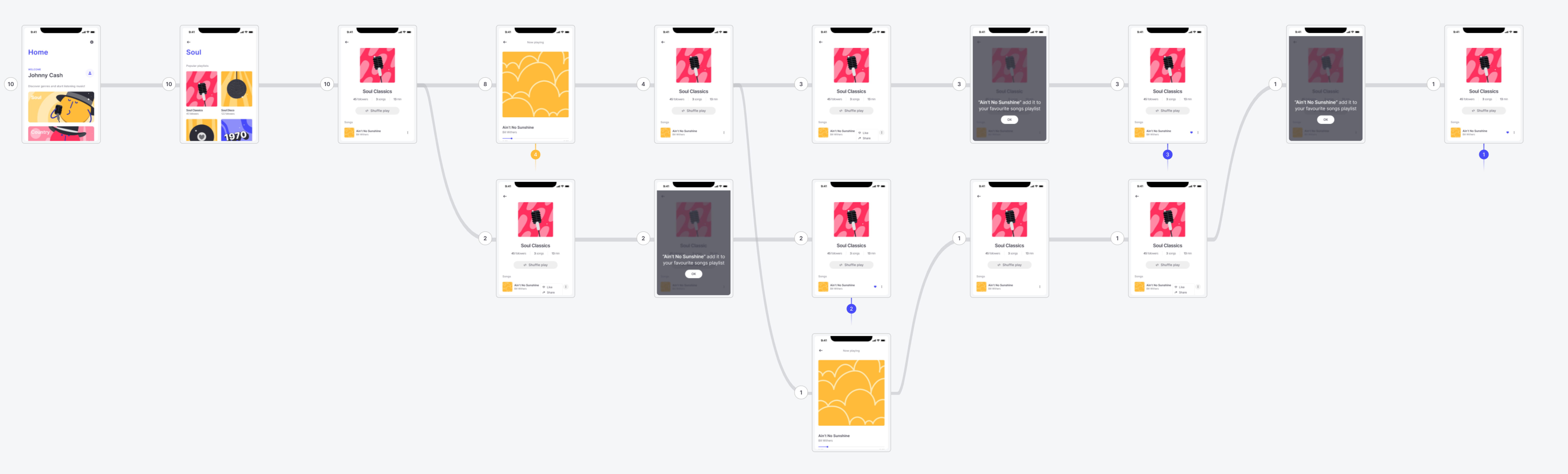
The path that the users “should” take and where they “should” click in order to complete the task appears in the screenshot.
The whole prototype that we are using appears in the following screenshot:
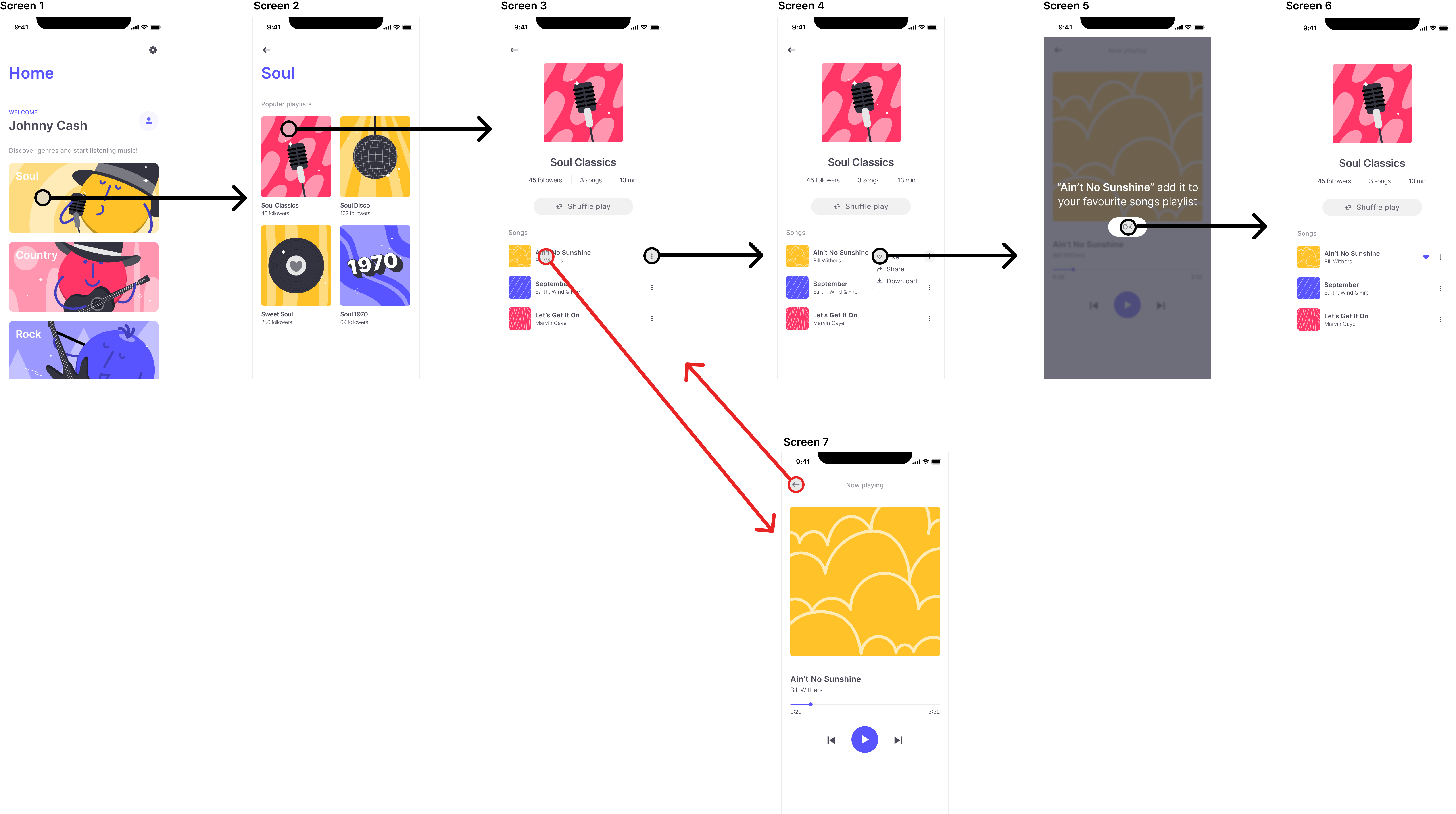
For the purposes of this example, we created the prototype with Figma for which we used the Useberry plugin.
Let’s start our test:
Task: Add a track to your favorites list
Instructions: Navigate through the prototype and add a track to your wish list.
Type of test: Single task
Number of blocks used in Useberry: 2 (Single Task, Thank you)
Audience: People from a Facebook group of music fans
Number of testers: 10
Time to get back results: 4 minutes
Link to the test: https://app.useberry.com/preview/XT84tChQ/
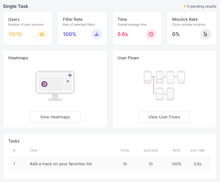
Results:
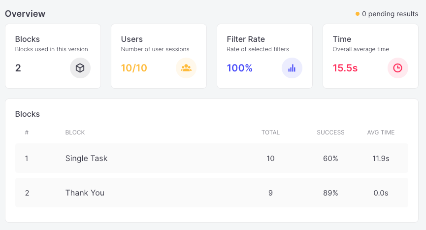
OK, we have 60% success in the single task which means that 4 of our users couldn’t complete the task successfully.
But WHY is this the case?
It was so obvious what they had to do, you might think.
Let’s focus on the single task now and look at the results:
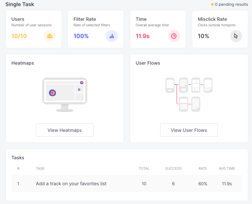
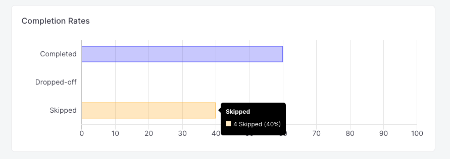
Ok, we can see that 4 users skipped the task.
Now, we have 2 options:
- Filter the results and watch the session recording of the specific users
- View the user flow and find the pain area
With 10 testers it’s easy to monitor the session recording of 4 users but on a larger scale – what would happen if we had more than 100 users?
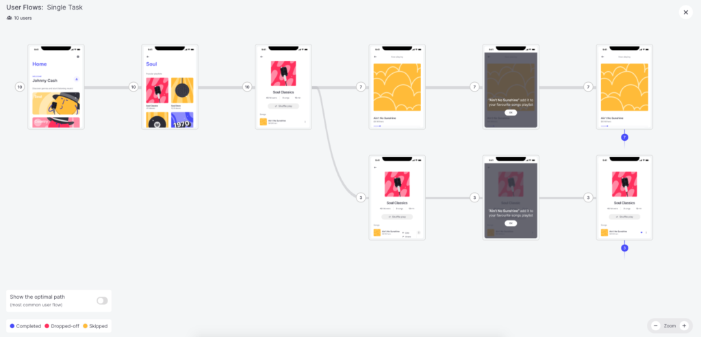
So, let’s examine the User Flow in order to better understand what happened.
And the results are…
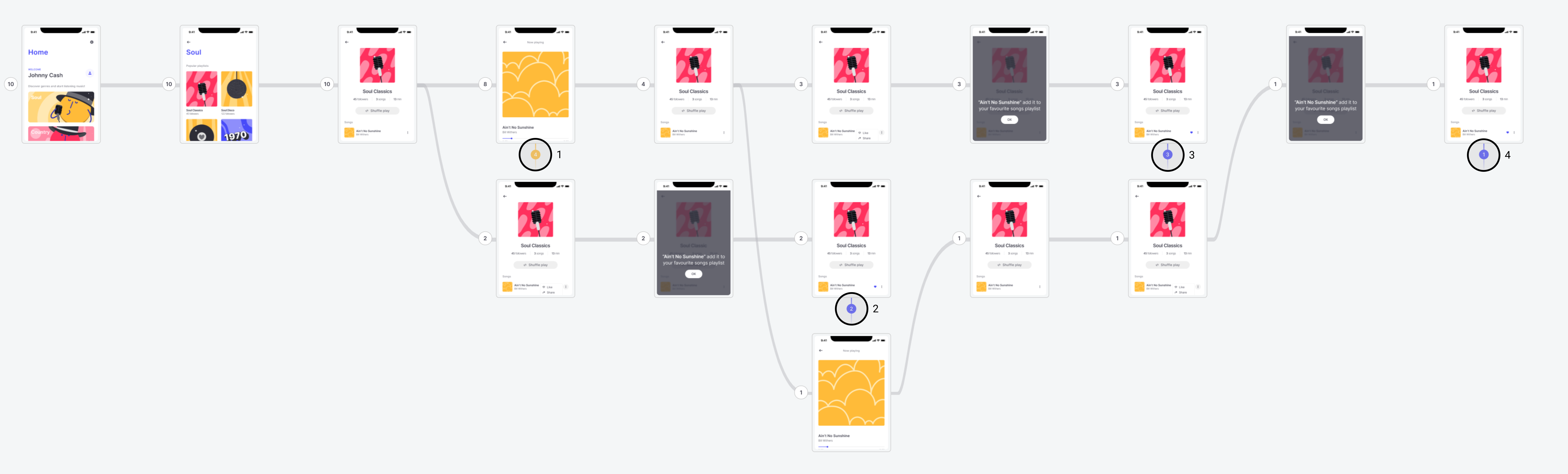
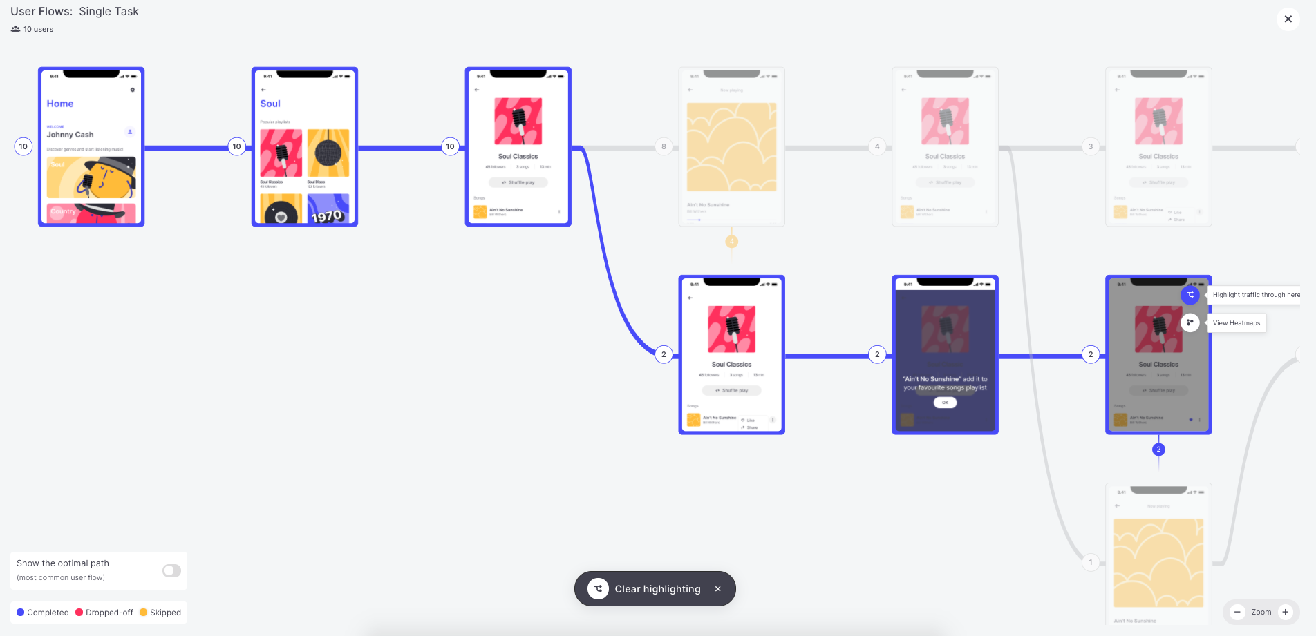
Lines and Curves.
This looks a bit complex (or not!) but let’s analyze it anyhow.
Let’s zoom in a little bit and explain what we can see here.
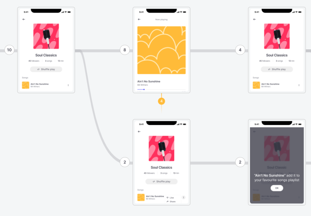
Think of the User Flow as a table.
Every cell is an incremental navigation step and every row is a screen that appeared on the specific navigation step.
We then group unique screens with unique navigation steps and we create the User Flow.
Next to every screen, you will notice a number, and some screens may have a colored number below them.
The number next to the screen is the number of unique users who landed on the specific screen and the number below the screen is an event.
Here at Useberry, we capture 3 different events:
Yellow event (Skip): Number of users who skipped the task on the specific step.
Blue event (Success): Number of users who completed the task on the specific step.
Red event (Drop-off): Number of users who dropped-off (totally closed) the test on the specific step.
Now, let’s go back to our example and the results that we have obtained.

In our User Flow example, we can see that we have multiple paths that users followed to complete their task.
(In this specific example, we don’t have users that closed the test before it ended which is why we don’t have red events.)
If we look carefully at the User Flow, we realize that we have 4 different screens that have events under them, which means that we have 4 different flows.
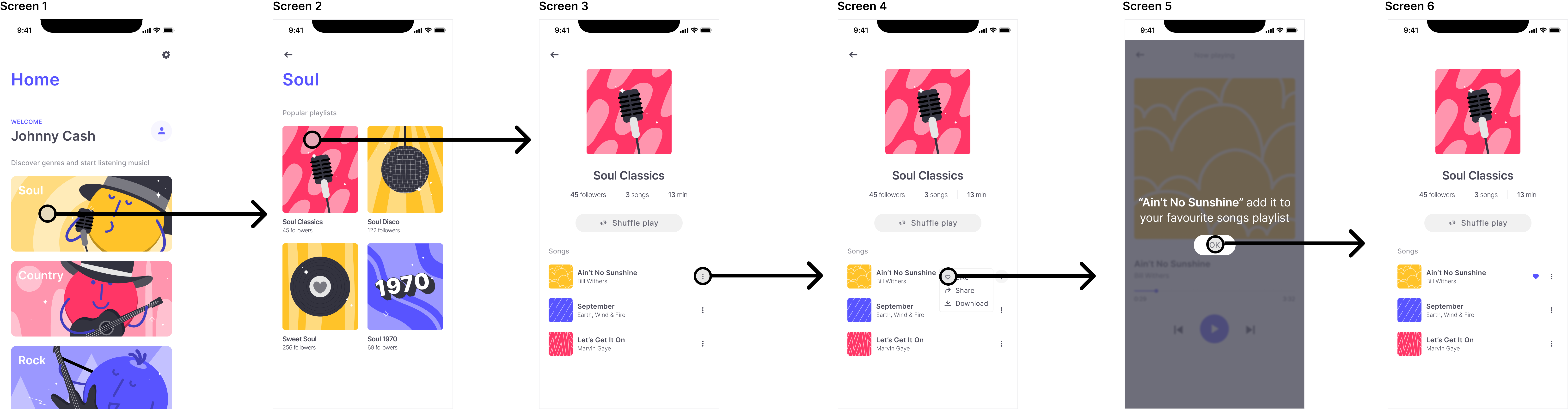
Optimal Path
Clicking the”Optimal path” button we can see the most common flow that users took in order to complete their task.
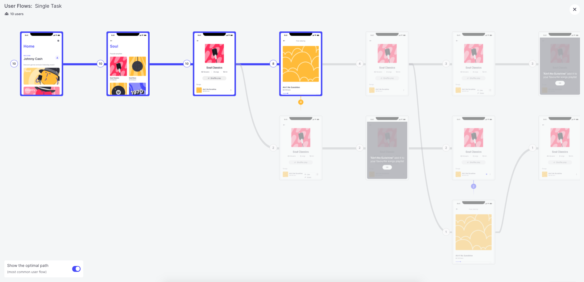
Oh, wait…
Those are the users that skipped the task!
The “top path” is the most common user flow. It’s the series of screens seen by your typical tester. Every app has one. But not every designer knows what it is.
Namely, 4 users took the exact specific path and these users skipped the task after they landed on a specific screen.
Bearing in mind the expected path and seeing that the optimal path is not the same as the expected path, we can quickly figure out that we need to modify our design in order to increase the success of the test.
Let’s go a little deeper, though.
If we look carefully at the screen where testers split, we can see that that’s where we need to focus.
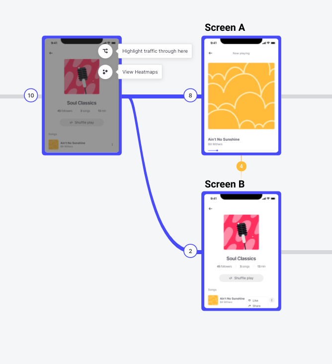
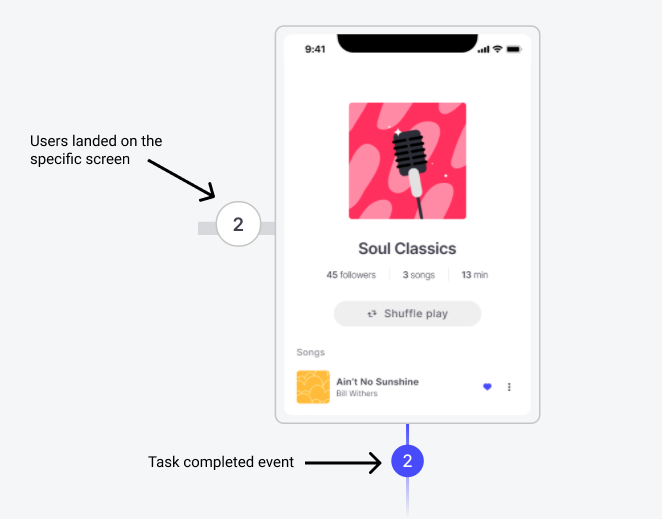
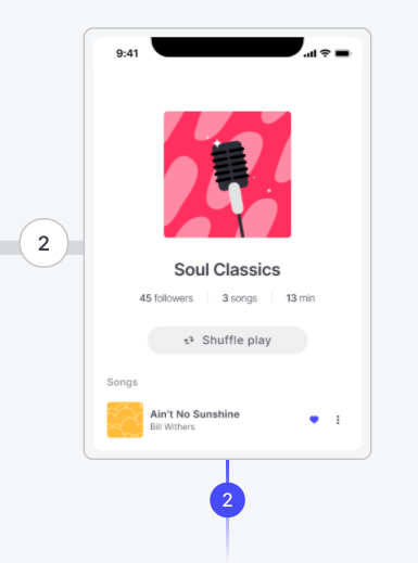
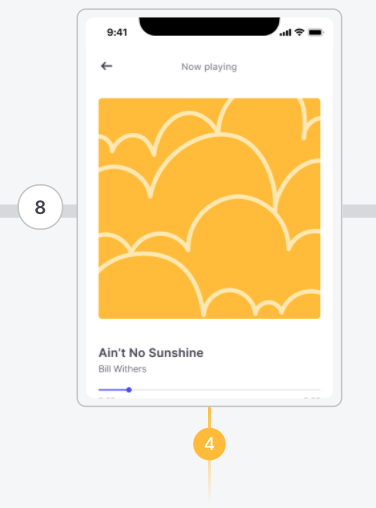
We have 8 users who landed on screen A and 2 users who landed on screen B. On our expected path, screen B is the “expected” screen. The users MUST go there in order to complete the task.
So, we have two options – change our design in order to lead these 8 users to screen B or design “something” on screen A to satisfy our users.
Now let’s see where the users clicked and why they split.
How?
Just click “View Heatmaps” on the specific screen.
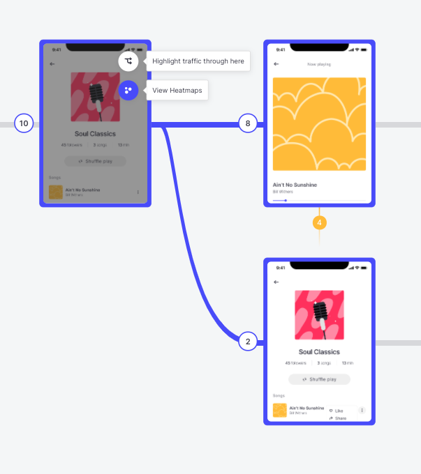
By clicking heatmaps on a screen you will see where the users clicked when they were on the specific screen and the specific path step
And the results are…
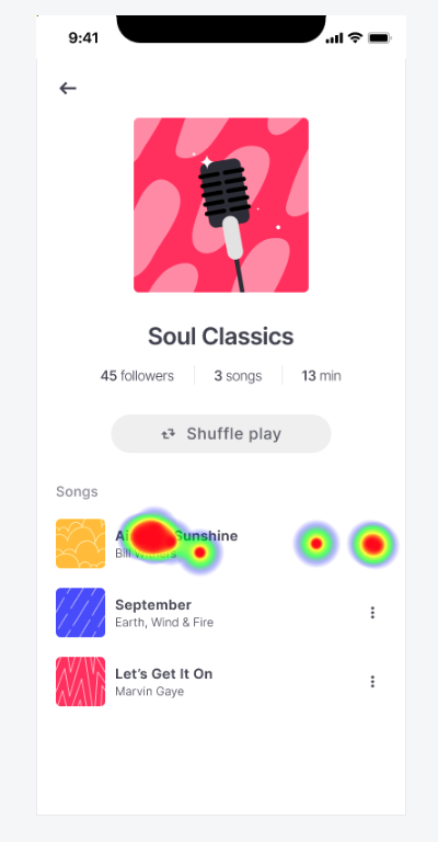
Aha… Interesting!
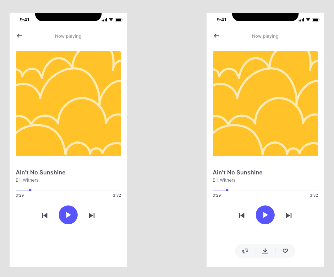
It seems that our testers and our potential users, in order to add a track to their wish list, first navigate through the specific track. (makes sense!)
Well, a possible solution to this is to satisfy our users when they land on screen B. That’s why we changed the design and added a bar with the “add to wishlist” button on the specific screen and run a new test again.
Task: Add a track to your favorite list
Instructions: Navigate through the prototype and add a track to your wish list.
Type of test: Single task
Number of blocks used in useberry: 2 (Single Task, Thank you)
Audience: From a Facebook group of music fans
Number of testers: 10
Time to get back results: 4 minutes
Link to the test: https://app.useberry.com/preview/hbtk48wW/
And the results of the new test are…
Amazing! We actually increased our conversions!
Conclusion
We managed to find an issue in something we thought was obvious and we resolved it quickly with the help of the user-flows.
Running tests in the design phase helps you save time and effort and solve UX issues that never even occurred to you before.
Maybe the results of the test are obvious but this is just a demo and an example in order to explain what user-flow looks like and how it can help you resolve UX issues.
With more complex prototypes and more testers, the user-flow becomes more complex, too, but we are trying to add features to make it as friendly as we possibly can – it’s up to you if you want to dig into it.
So, happy designing, and feel free to come forward with any suggestions!
A bonus tip – Highlight traffic through here.
If you want to see the path that users took in order to land on a specific screen on the user-flow, just click the “highlight traffic through here” button!
Feel free to contact us!
We’d love to know your experience with Useberry and we will be excited to hear your thoughts and ideas.