In the digital age, user experience (UX) design has become a crucial component of product development as companies strive to give their customers the most optimal experience possible. The dominant narrative surrounding UX design, however, is frequently based on assumptions that may not necessarily be true. In this article, we’ll look at several typical UX design assumptions and explore examples that contradict the dominant narrative. We’ll also highlight how essential it is to challenge assumptions and validate design choices to make sure they satisfy user needs.
Questioning Assumptions in UX Design
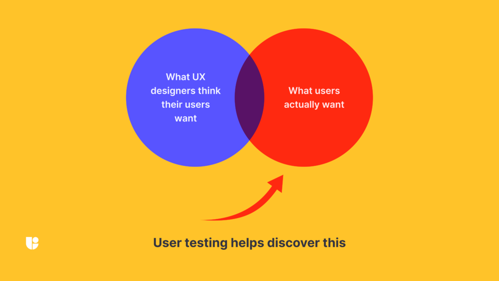
Humans naturally make assumptions, and in many situations, these assumptions can be useful. However, the user experience can be negatively impacted by assumptions in UX design. For instance, it might not always be accurate to assume that users are aware of what they need and how to reach their goals. By uncovering user needs and preferences, user research could help designers create engaging user experiences.
One of the most significant benefits of challenging assumptions is that it allows us to design stronger and more user-centered experiences. By questioning assumptions, we can prevent designing experiences that put company goals and technical limitations above user needs and preferences. Increased user satisfaction, engagement, and retention can result from this.
The Assumption: Simple is Better in UX Design

It’s a popular belief in UX design that users prefer simple and minimal designs. Although it might be the case for certain users, this isn’t always the case. For instance, a minimalist design without obvious navigation or user-friendly interfaces may potentially be confusing and challenging to use. Users may become frustrated trying to find what they’re looking for, leading to a negative experience overall.
Contradicting this assumption, we can use the well-known online publishing platform Medium as an example. With a variety of UI elements, animations, and functionalities, Medium’s design is anything but minimalist. With a simple and intuitive navigation system, the design remains highly user-friendly and enables users to find and interact with content with ease.
Usability testing can help determine whether users prefer a minimalistic or more complex design. Which design is more user-friendly can be determined by observing how users engage with different concepts of the design. With the use of Useberry’s research methods, you can accurately get the results you need for each study.
The Assumption: Speed is Everything in UX design

Speed and efficiency should always come first, according to another popular assumption in UX design. Although it is true that people seek quick and effective experiences, this is not necessarily always the most important factor. For instance, a website that places emphasis on speed rather than user needs and preferences may skip crucial features or information in order to load more quickly. Users may not be able to quickly execute tasks or find what they’re looking for, which can have a negative impact on the user experience.
We can examine Basecamp, a project management tool, as an example of contradicting this assumption. Basecamp’s purposeful design encourages users to slow down and take their time to concentrate on their tasks, prioritizing usability over speed. The software’s features are human-centric and make it simpler for users to efficiently collaborate and communicate.
The Assumption: Users Know What They Want
Another typical assumption in UX design is that users already know what they want. This assumption is founded on the notion that users are the best judges of what is ideal for them. This assumption, however, can be problematic. People may struggle to express what they want, and one‘s preferences might not always match what they actually do.
Take the iPod as an example. It wasn’t immediately obvious that there was a demand for a digital music player when the iPod was originally introduced. Apple’s designers understood, however, that people might not know what they want until they see it. Apple was able to open up a brand-new market for digital music players by developing a product that was straightforward and simple to use.
User’s needs and preferences may not be clear, but usability testing with Useberry can help reveal them. You may learn a lot about what users really want by watching how they engage with your products. Single Tasks, Open Analytics, and First Clicks are popular methods of testing to see how users interact with your products. While with Video Shoots you can get qualitative insights by watching your user’s face, voice, and screen while they complete tasks on your website or app.
The Assumption: I Know What My Users Want

A pitfall in UX design is assuming that the UX designer already knows what the user wants without conducting user research. Based on prior experiences, market research, and user feedback, this assumption is frequently made. The reality is that users are complex and diverse, and their needs and wants might not always coincide with what the UX designer anticipates.
Consider the scenario where a UX designer is assigned with creating a music streaming application. A recommendation engine that suggests new music based on a user’s listening history might be considered by the designer as the most significant feature.
The UX designer could miss key aspects that could have a big impact on the user experience if they make the assumption that they know what the user wants. User research is essential to UX design, and assumptions should always be backed up with data and user feedback. To make sure that your product satisfies the changing needs of your users, it is crucial to remain open to user feedback and to carry out continual research.
The Assumption: Consistency is Key in UX Design

A key component of effective UX design is consistency, which is commonly discussed. Users should be able to anticipate how a system will behave based on their prior interactions with it, according to the idea. This assumption, nevertheless, can sometimes be overstated.
Take the Gmail inbox as an example. Unlike a regular email inbox, the Gmail inbox is not structured the same way. Gmail utilizes a sophisticated algorithm to identify which emails are most important to the user rather than organizing them by sender or date. Although this lack of consistency may be confusing at first, users eventually come to trust the algorithm and depend on it to identify and prioritize their most important emails.
Usability testing can help UX designers determine whether a lack of consistency can be more beneficial than complying with established norms. Analyzing how users adjust to inconsistency can help them decide if it’s better for their designs.
The Assumption: Aesthetics are Secondary in UX Design

Aesthetics and usefulness are sometimes at odds in UX design. The assumption is that aesthetics should never take precedence over usefulness. This assumption, however, is not always accurate. Aesthetics can be extremely important, in terms of how users view and interact with a design.
Take the Apple iPhone as an example. One of the most aesthetically pleasing mobile devices available is the iPhone, which is highly appreciated. Its aesthetic value, however, goes beyond the surface. The functionality of the iPhone is directly related to its design. A touch screen, for instance, enables a more immersive and intuitive user experience than a conventional keyboard and mouse.
UX designers can learn how aesthetics affect user perception and interaction with their designs by conducting user tests. By testing different designs with real users, they can determine which designs are more aesthetically pleasing and effective. A popular testing method is the Preference test to get insights on which variation users prefer, and with an additional survey, to understand why they chose it.
The Assumption: Users are Rational

The notion that users are rational beings is another common assumption in UX design. Users are presumed to make decisions that are always in their best interests. In reality, this assumption does not always hold true. Users are frequently affected by factors beyond their rational control, such as biases and emotions.
Take social networking platforms such as Facebook and Twitter as an example. Advanced algorithms make these platforms addictive to keep users engaged for as long as possible. Many users continue to use social networking platforms compulsively despite the possible adverse effects of excessive use, influenced by factors beyond their rational control.
The Assumption: Users Want Control

Giving users control over their experience is frequently emphasized in user experience (UX) design. It is believed that giving users greater control over how they engage with a system will make them happier and more satisfied. This assumption is not always accurate, though. In certain cases, people actually prefer a more passive experience in which there are fewer choices to be made.
Take Netflix as an example of a streaming video platform. These platforms are made to provide consumers with a wide variety of content to pick from, as well as several customizing choices. However, many users actually prefer the algorithmically curated playlists that these platforms offer, which provide a more passive viewing experience.
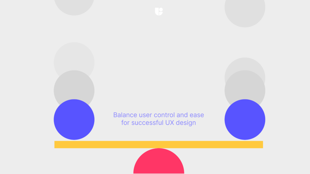
Ultimately, the key to successful user experience design is to strike a balance between giving users control over their experience and providing a more passive, effortless experience. UX designers must consider the needs and preferences of their target audience while designing interfaces. By carefully considering the level of control users want and need, designers can create interfaces that are intuitive, enjoyable, and satisfying to use.
The Assumption: Users Want Feedback

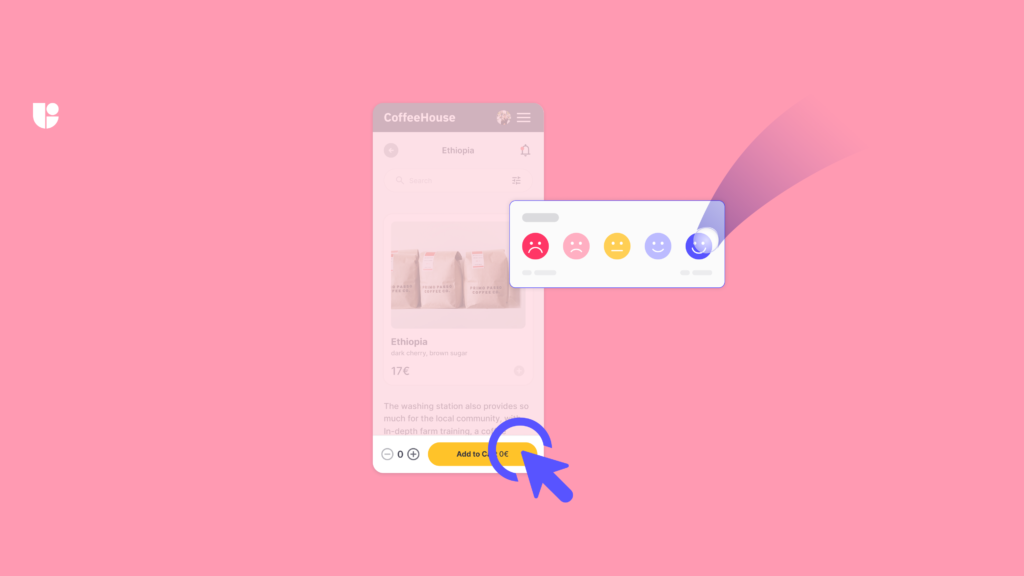
Giving users feedback is frequently an emphasis in UX design. It is assumed that users want to be aware of how their interactions with a system are impacting it. This assumption is not always accurate, though. Users might actually prefer a simpler approach where they are not continually bombarded with feedback.
Think about the iPhone camera app as an example. The software simply offers a brief screen flash and the sound of the shutter as feedback while snapping a picture. This minimalistic approach allows users to focus on the moment they’re capturing rather than the app’s feedback.
When designing feedback, it’s essential to find the right balance between giving users just enough information to be useful without overwhelming them. UX designers can test a design with real users to determine if the feedback is helpful, distracting, or excessive.
Conclusion
In conclusion, challenging assumptions in UX design can lead to more effective and user-friendly designs. This article’s examples illustrate that the dominant narrative in UX design may not always be optimal. UX designers can use user research to challenge assumptions and build products that meet user needs.
For those seeking to stay ahead of the game in the ever-evolving field of UX design, “The Future of UX Design Jobs” is a valuable resource, covering topics such as inclusive design practices and the growing use of automation and AI in UX design.
Are you making assumptions in your UX design process?
Unlock the true potential of your design by testing and creating experiences that cater to your users’ real needs.


