Let’s face it: push notifications have a bit of a reputation problem. When done poorly, they’re seen as intrusive, irrelevant, and just plain annoying. No wonder users are quick to disable them. But here’s the twist: push notifications can be incredibly useful, when designed with the right user experience in mind. Nobody wants to be woken up at 2 a.m. by a “flash sale,” right? The challenge is to strike the perfect balance between engaging your users and respecting their boundaries.
Let’s explore the UX of push notifications: why they matter, what’s often done wrong, and how to fix it with a user-first mindset. Thoughtful design and testing can turn push notifications into a tool that users actually appreciate.

The UX of Push Notifications: What We’re Doing Wrong
Push notifications often fail because they’re not crafted with user behavior or preferences in mind. Here are some common pitfalls:
- Bad Timing: Asking for notification permissions immediately after app launch gives users no context for why they should opt-in. It’s like being asked to trust someone before you’ve even said hello.
- Irrelevance: Notifications that don’t align with user interests, like “weather updates” for a fitness app, feel more like spam than helpful nudges.
- Overload: Bombarding users with notifications not only dilutes their value but also risks driving users to disable them altogether.
- Poor Design: Lengthy texts, unclear CTAs, or clunky visuals make notifications harder to process and less effective.
Push notifications aren’t inherently bad. But they need thoughtful design to deliver value without becoming a nuisance. So, how can we fix this?
The Do’s and Don’ts of Push Notification UX
To create notifications users will actually welcome, here are some best practices:
DO:
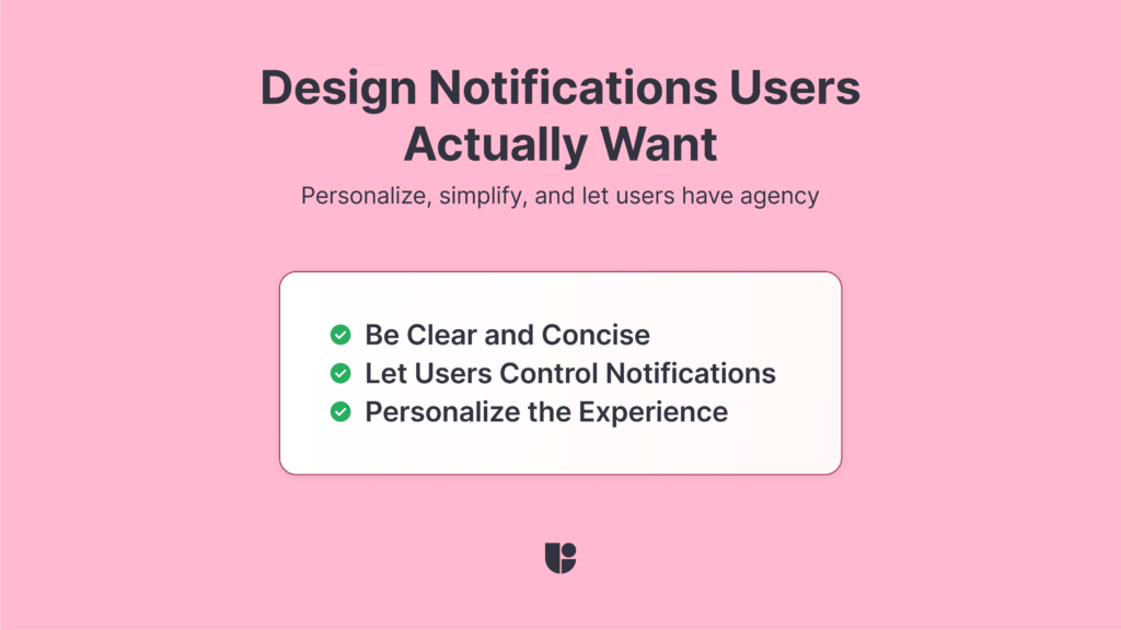
- Be Clear and Concise: Keep messages short and relevant. Use action-oriented language to make it obvious what users can do next.
- Let Users Control Notifications: Provide options to customize frequency and type. For example, let users choose between “promotional updates” or “reminders.”
- Personalize the Experience: Use data to send notifications tailored to user preferences, like reminders for bookmarked items or progress updates.
DON’T:
- Be Overbearing: Avoid sending too many notifications. Quality over quantity is key.
- Be Generic: Notifications that feel like mass marketing will get ignored or muted.
- Neglect Visuals: Poor design, such as mismatched fonts, harsh colors, or overwhelming text, distracts from your message. Keep it clean and branded.
Remember, push notifications should feel like helpful nudges, not unwelcome interruptions.

Testing and Improving Push Notifications with UX Insights
The secret to effective push notifications? Testing, testing, and more testing. Here’s how UX testing tools like Useberry can help:
- Preference Testing: Experiment with different designs, colors, or tones for your notifications. Would a bold red button work better than a soft blue one? Testing gives you the insights to know for sure.
- Feedback Surveys: Run follow-up surveys to ask users directly why they liked or disliked certain notifications. What made them enable or disable push notifications or what would make them enable it in the future based on the design they just saw.
- Not all users are the same and you should run your UX study with the relevant ones. Recruit participants that are representative of your audience with Useberry’s participant panel and ask them for the best results!
- Timing Experiments: Test the impact of sending notifications at different times of the day or week to find what works best for your audience.
By continuously gathering feedback and tweaking your approach, you can refine your push notification strategy to meet user needs more effectively.
Push Notification Experience on Your Website
When we think of push notifications, we usually think about mobile first but more and more websites are using push notifications for sharing (live) updates or designing features around it. Think about how many times your browser asked your permission to send you push notifications for one website or another. Approving these requests is a double-edged sword. It could either improve your experience significantly or be a constant source of interruption and spam. So how can we tell if the the push notification you are designing for your website is providing a good experience for your users? You can take advantage of features like Useberry’s website usability testing to get insights from real users and get their feedback on the push notification experience you created.
Timing is Everything: When to Ask for Permissions
One of the biggest UX mistakes with push notifications is asking for permission too soon. Picture this: you’ve just downloaded an app, and before you’ve had a chance to explore, it hits you with, “Can we send you notifications?” For most users, the knee-jerk reaction is a firm “No.”
Instead, wait until users are more familiar with the app and its benefits. For example, after completing a key action or achieving a milestone, gently introduce the notification prompt with context: “Want to stay updated on your progress? Enable notifications so you never miss a step!”
Because nothing says “annoying” like an app saying “can I bug you later?” five seconds after launch.
The Psychology Behind Push Notifications: Why We Engage
Push notifications tap into behavioral triggers like curiosity, urgency, and reward. When done right, they create a sense of value and connection. But when overused or poorly designed, they invoke feelings of frustration and distrust.

What Drives Engagement?
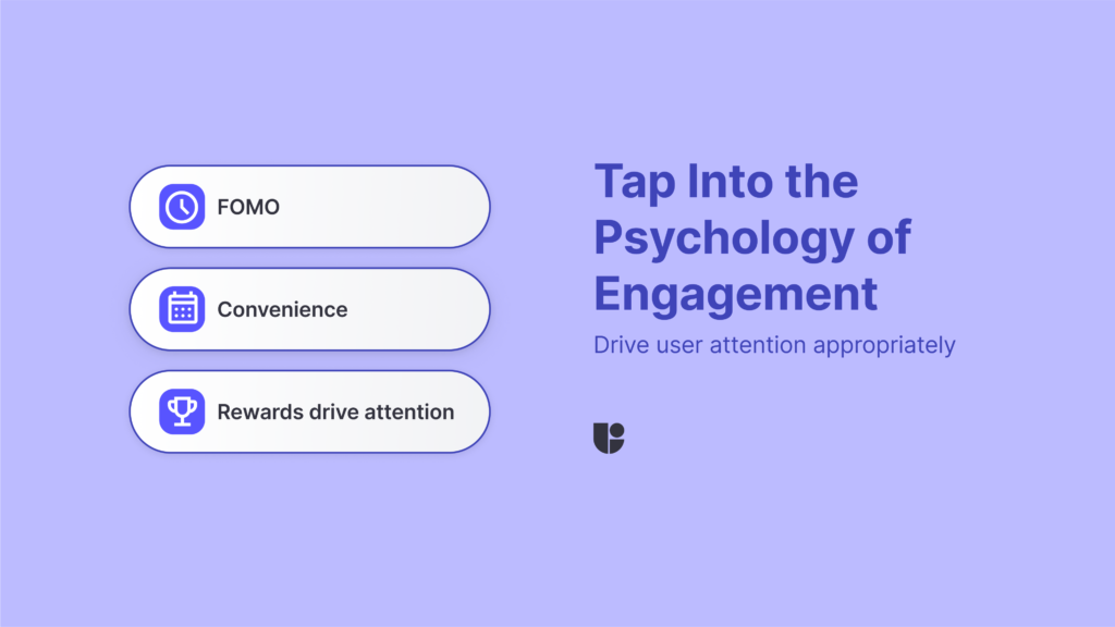
- FOMO (Fear of Missing Out): Limited-time offers or exclusive updates spark curiosity and compel users to act quickly.
- Positive Reinforcement: Celebratory messages like “You’re on a streak! Keep it going!” reward users, encouraging continued engagement.
- Convenience: Notifications that save time or effort, like reminders or shortcuts, are more likely to be welcomed.
What Causes Frustration?
- Interruption Fatigue: Notifications that disrupt focus or relaxation are more likely to be dismissed or disabled.
- Perceived Insincerity: Overly promotional or irrelevant messages make users feel like they’re being used, not valued.
Understanding these psychological drivers can help you craft notifications that not only deliver value but also foster a stronger relationship with your users.
Conclusion: The UX You Can’t Ignore
Remember that push notifications are more than just alerts. they’re touchpoints that can make or break the user experience. With thoughtful design, strategic timing, and consistent testing, you can turn them into a feature users actually value.
Ready to improve your push notification game? With Useberry, you can test, iterate, and perfect every element of your UX. Whether it’s A/B testing designs or gathering user feedback, we’ve got the tools to help you craft notifications that truly engage.
When notifications feel like helpful nudges, not unwelcome shouts, everyone wins.
Ready to take your push notifications to the next level?
Start testing and improving your UX with Useberry


