If you’ve ever stared at a button wondering whether labeling it “Continue” or “Next” would be better, congrats, you have already dipped your toes into the world of UX microcopy. Microcopy is all the little bits of text that guide, reassure, and prompt users as they move through your product such as button labels, error messages, tooltips, form hints, etc. It’s the quietly helpful copy that shapes how intuitive and seamless it feels to navigate your prototype or product.
As a marketer working closely with designers and researchers, I’ve learned that microcopy isn’t just a UX detail. It carries your brand voice, sets user expectations, and often decides whether someone “flows” forward or drops out.
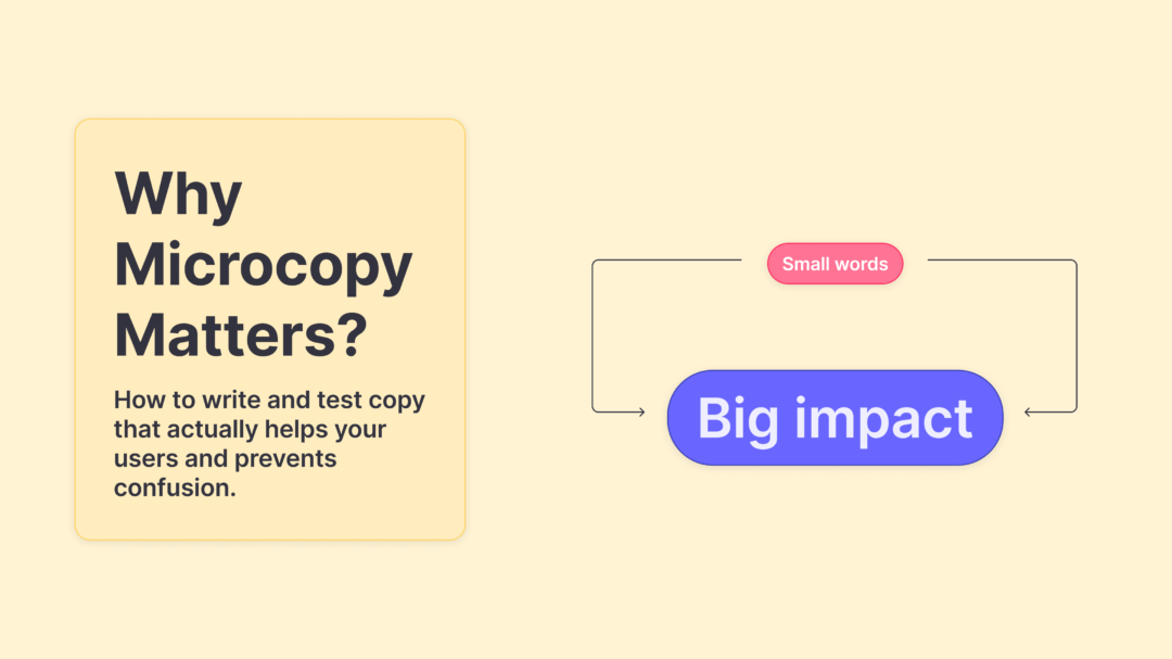
Why Microcopy Can Make or Break Your User Experience
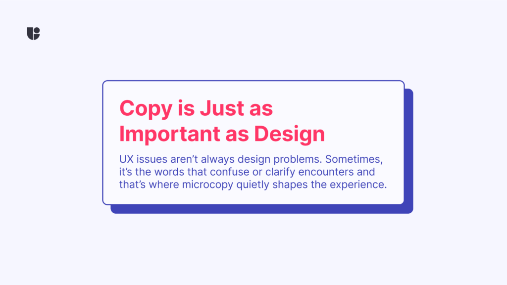
We often think of UX in terms of layout, color schemes, or navigation structure. But many moments of friction come down to the words on the screen. A vague label, a confusing confirmation or an error message that feels like it’s blaming the user could cause frustration and end a user’s journey prematurely. That’s why microcopy matters.
The best microcopy feels invisible because it works. It doesn’t call attention to itself, it just helps users move forward smoothly. But when it fails, it becomes painfully visible. It’s the difference between a user thinking, “That was easy” versus, “Wait, where do I go now?”
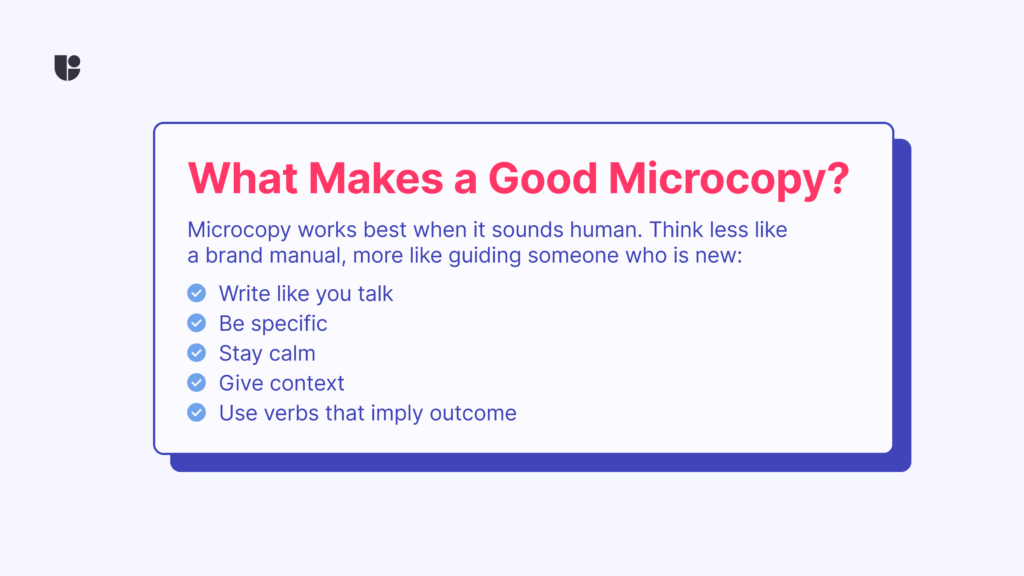
So what does good microcopy actually look like in practice?
- Write like you talk – If you wouldn’t say it in person, don’t say it in your UI.
- Be specific – “Invalid input” is less helpful than “That email address address is invalid.”
- Stay calm – Your message should calm and redirect the users in the right direction, not panic them further.
- Give context – Let users know what to expect before they click.
- Use verbs that imply outcome – “Get started” feels more inviting than “Click here”.
Think of each word as a touchpoint. You’re setting expectations, building trust, and helping users feel confident. Even the smallest copy choice can shape perception and influence behavior.
How to Start Writing Microcopy That Actually Works
Knowing what makes good microcopy is one thing. Writing it is another. The best approach? Start simple and empathetic. Read every copy as if you’re the user. Ask yourself: does this make sense to someone who’s never seen this interface before? This is one of the steps in Cognitive Walkthrough method which is very useful in understanding learnability of your copies.
Let’s take a few examples:
- A tooltip that says “Need help?” is fine. But one that says “Step by step walkthrough” sets clearer expectations.
- A button labeled “Continue” might confuse users if it’s the final step. Something like “Finish and Submit” makes the outcome clearer.
- An error message that simply says “Error” doesn’t help anyone. “Looks like something went wrong with your upload. Try again in a moment” is better.
If you’re ever stuck, (before you start testing) read your copy out loud. If it sounds weird, it probably is. A small shift in words can turn a moment of confusion into one of clarity.
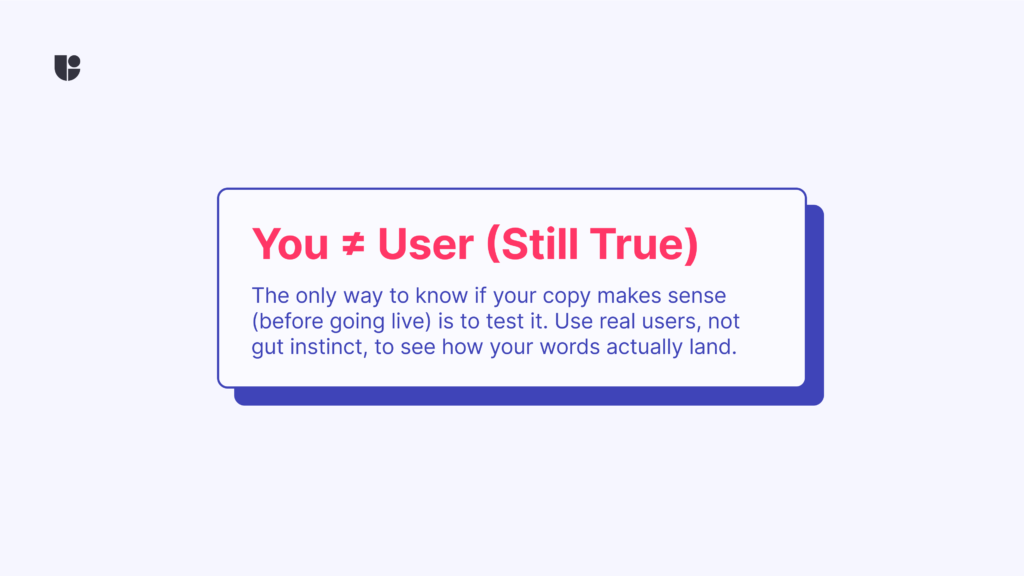
How to Know if Your Microcopy is Actually Working
Remember when we said, “Read every phrase as if you’re the user”? Well, here’s the twist: you ≠ user is still one of our golden rules in UX. What sounds clear to you might land differently for someone else. That’s why testing your microcopy with real users is essential. Microcopy is easy to underestimate, but it’s also surprisingly easy to test. You don’t need to run a full usability study to figure out if “Submit” feels scarier than “Send.” That’s where tools like Useberry come in.
Here’s how we approach testing microcopy with Useberry:
1. Preference Testing for wording decisions
Want to know whether “Create account” or “Get started” works better on your CTA? Run a preference test. Useberry makes it simple to show both options to real users and gather quick feedback.
2. Card Sorting for category clarity
Trying to figure out what label makes sense for a new settings page? Use a card sort. See how users naturally group or label things. It can reveal whether your terms are intuitive or just internal jargon.
3. Tree Testing for navigation language
If users can’t find something in your menu, the words might be to blame. Tree testing helps you isolate the issue by stripping away design and testing the logic and wording of your structure.
Are these the only ways we can use for testing, absolutely not! We can use our First Click testing to setup an A-B testing study and even add Randomization into the mix to mitigate biases. Or setup an open text question using our Survey task to participants alongside an images with copies and ask them to explain what they understand from reading these copies.
Remember that what you are really testing isn’t just language. You’re testing understanding. You’re seeing if users interpret your product the way you intend. And more often than not, microcopy is the bridge between confusion and clarity.
Wrapping It Up: Microcopy Is a UX Lever Worth Pulling
Microcopy isn’t fluff. It’s not an afterthought. It’s one of the most critical and potentially powerful part of your user experience. When done well, it can make your product feel smarter, smoother, and more human. The main takeaway is that great microcopy doesn’t have to be flashy. But it should be intentional. If we treat it as part of the design, not just an afterthought, we create smoother experiences that make people feel like your product just “gets” them.
So next time you’re reviewing a prototype, don’t just look at the layout and read the words. Better yet, test them.
Want to start validating your copy choices?
Try out Useberry’s Preference Testing, Card Sorting, or Tree Testing to see what your users think.