Card sorting is an insightful method that reveals the intricacies of user mental models and preferences. If there was a tool that lets you peer into the minds of your users, discerning how they naturally categorize information. Surely, that tool would be Card Sorting.
It is used to gather insights about how users perceive and categorize information. It involves participants organizing and categorizing content into groups that make sense to them. This method helps designers and researchers understand users’ mental models, expectations, and preferences when it comes to information.
Conducting Card Sorting
You can conduct it in different ways:
- Open card sorting – participants create their own categories
- Closed card sorting – participants sort cards into predefined categories
Choosing between open and closed card sorting depends on the research goals and the stage of the design process. Firstly, open card sorting is often used in the early stages to explore users’ mental models and generate insights for a new information architecture. Closed card sorting, on the other hand, is more applicable when assessing and refining existing structures or when specific categories need to be tested.
If you are more interested in evaluating the information architecture hierarchy, we recommend using Tree Testing as a research method. Moreover, if you would like to know more about tree testing, you can check our blog on Tree Testing Basics.
Open Card Sorting
In open card sorting, the researcher presents a set of cards without pre-established categories or labels to the participants. Afterward, participants are asked to organize the cards into groups based on their understanding and mental models. They are also typically responsible for creating labels or names for the groups. This method allows for more flexibility and creativity on the part of the participants. It reveals how users naturally conceptualize and categorize information without any predefined constraints.
In summary, open card sorting is useful for gaining insights into users’ mental models, understanding how they naturally group content, and identifying potential categories that designers might not have considered.
To help you get started on your first study, you can also use the ready-made Open Card Sorting Template on our platform that we have prepared for you.
Viewing Open Card Sorting Results on Useberry
When you complete your study, you will view the results page on Useberry. You can use the below section to familiarize yourself with the results user interface (UI) and get the most out of each tab of the results menu.
1. Cards

See how each card was categorized by your participants and explore their interpretations.
- Swiftly recognize the cards that were distributed among various categories and those that were commonly grouped into the same categories.
- Arrange each column in this display in either ascending or descending order.
- View the regions of agreement and disagreement among your participants along with any confusing card labels.
- By standardizing categories the card view will adjust its data to reflect the standardization you’ve implemented. Standardizing categories is achieved by combining categories that are very similar into a single category.
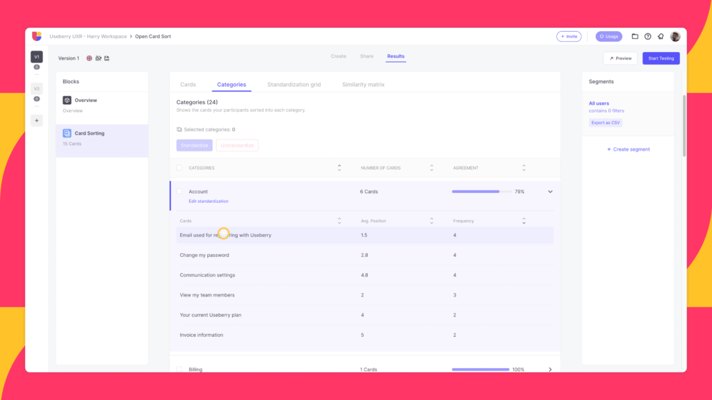
2. Categories

Explore the categories formed by participants, the names they assigned to these categories, and the cards they allocated to each specific category.
- Uncover the terminology or wording employed by your participants, and check if they placed common cards within categories with similar names.
- For easier data analysis, standardize the categories in cases where participants have grouped similar cards together and given those categories similar names.
- Combine two or more categories by choosing them and clicking the “Standardize” button. After doing so, you can observe the “Agreement rate” for this standardization, with a higher percentage being the most favorable outcome.
- Cards view automatically mirrors the standardization.
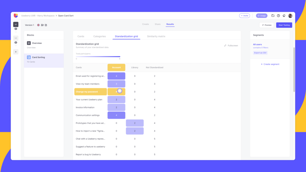
3. Standardization Grid

Summary of your standardized data showing card placements throughout the standardized categories.
- Every cell in the table indicates how many times a card was placed into the corresponding standardized category.
- A deeper color shade in the cell signifies that a higher number of participants agreed with this particular grouping.
4. Similarity Matrix

Shows the proportion of your respondents who grouped any two (2) cards in the same category.
- The cell where each pair of cards intersects shows the percentage of users that combined those particular cards.
- A deeper color shade in the cell signifies that a higher number of participants grouped those specific cards together. Darker clusters can assist in recognizing potential card groupings.
Closed Card Sorting
In closed card sorting, participants are provided with a set of cards along with predetermined categories or labels. Participants need to sort the cards into the provided categories. Unlike open card sorting, they do not create their own categories. As a result, you have more control over the sorting process with this method. Also, participants organize the content according to predefined criteria from the designer’s perspective.
Closed card sorting is useful for evaluating the effectiveness of an existing information architecture, navigation menu, or categorization system. Consequently, It helps assess whether users can match content with the predetermined categories as intended. You can also use it to update an existing IA, navigation, categorization system with new items.
To help you get started on your first study, you can also use the ready-made Closed Card Sorting Template on our platform that we have prepared for you.
Viewing Closed Card Sorting Results on Useberry
When you complete your study, you will view the results page on Useberry. You can use the below section to familiarize yourself with the results user interface (UI) and get the most out of each tab of the results menu.
1. Cards

Shows how each card was categorized by your participants. In this frame:
- Swiftly recognize the cards that were distributed among various categories and those that were commonly grouped into the same categories.
- Arrange each column in this display in either ascending or descending order.
- View the regions of agreement and disagreement among your participants along with any confusing card labels.
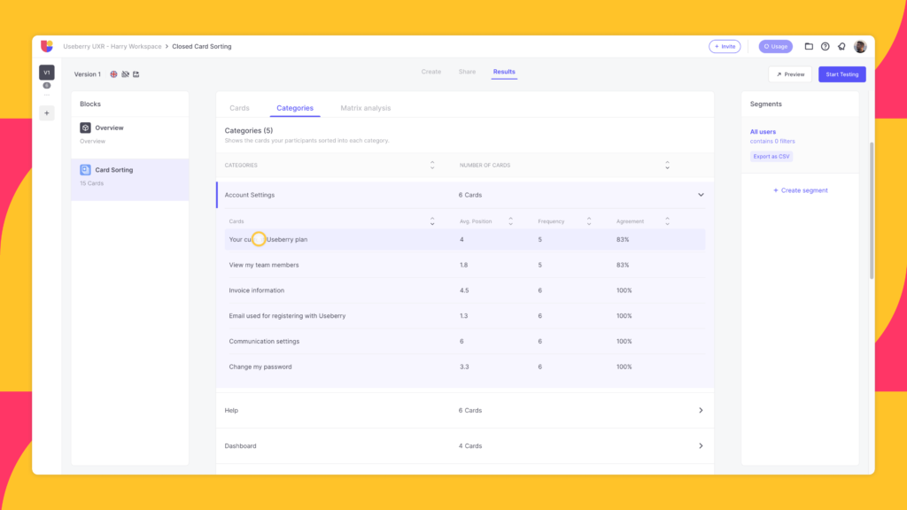
2. Categories

This section shows the cards your participants sorted into each category.
- Check the categories list along with the respective card stats in each category.
- You have the option to arrange each column in this view either in ascending or descending order.
3. Matrix Analysis

The Matrix Analysis shows the number of times/percentage each card was sorted into the corresponding category. It presents insights into the popularity of card placements for all categories.
- The figure within each cell at the intersection of a card and a category indicates the count of participants who categorized that card into the respective category.
- Toggle the “Show percentage” switch to display percentages instead of counts.
- A deeper blue shade signifies a greater number of participants.
Now that we covered the basics of Card Sorting, you can check out our Card Sorting Demo. Don’t forget to come back and follow up on use cases and recommendations!
Card Sorting Use Cases
Because of its versatile nature as a UX research method, you can apply card sorting to various scenarios to gain insights into how users organize and perceive information. Some of the most common use cases for card sorting include:
- Information Architecture Design – Understanding how users naturally categorize and group information to inform the creation or restructuring of website navigation menus and content organization.
- Website or App Redesign – Assessing the effectiveness of an existing information architecture and identifying opportunities for improvement in the redesign process.
- Content Organization – Determining the most intuitive ways to organize and present content, such as blog categories, product features, or news topics.
- Menu Labeling – Testing and refining the labels and names used in navigation menus to ensure they align with users’ mental models and expectations.
- Product Classification – Creating or refining product categories and subcategories in e-commerce websites to enhance the browsing and shopping experience.
- Labeling and Tagging Systems – Testing and refining labeling and tagging systems in content management systems, thus, making it easier for users to find and manage digital assets.
Card Sorting Study Recommendations
How many items to test per card sort?
The complexity of the categories and the users’ level of proficiency with the topic affects the overall time required. Also, seeing an enormous amount of items can be intimidating and lead to negligence or error on the users’ part.
William Hudson offers some guidance:
- 20 minutes for 30 items
- 30 minutes for 50 items
- 60 minutes for 100 items
Furthermore, on a remote unmoderated setting, the optimal length of a card sorting study would be approximately 30 minutes.
Optimal Sample Sizes
Firstly, we should emphasize that card sorting does not require an overabundance of participants for an effective test. It wouldn’t be cost-effective to have more than 30 participants even in a large, well-funded study. Although different sources give different answers on the exact sweet spot of study participants, the effective range would be between 15 to 30 participants. Tomas Tullis wrote that a sample size between 20 to 30 offers reasonable results for this type of study, on the other hand, NNgroup suggests that after 15 users, diminishing returns would start to set in and that 15 is a more than enough number.
In Summary:
- For studies with limited resources or smaller in size – A sample of 15 participants is enough
- For larger studies – 20 to 30 participants would be better
Why Card Sorting?
Card sorting is a valuable tool for any UX professional because of its ability to support user-centric design. By observing how participants naturally categorize and organize information, designers gain crucial insights into user mental models, informing the creation or refinement of information architecture. So, this method is instrumental in optimizing website and application navigation, identifying gaps in users’ understanding, and facilitating iterative redesigns based on user feedback.
Card sorting proves especially useful in content organization and prioritization, enabling designers to tailor interfaces to user preferences. For example, in the context of mobile app design, card sorting aids in optimizing navigation structures for smaller screens, ensuring a seamless and enjoyable user experience. Overall, its cost-effectiveness and efficiency make card sorting an indispensable tool for UX professionals seeking to create intuitive and user-friendly digital experiences.
If you enjoyed our article on Card Sorting, and looking forward to starting your Information Architecture studies with Useberry, we recommend watching our video on card sorting updates to hit the ground running with your setups:
Conclusion
Card sorting is a method that is very valuable in the field of information architecture. Since you can use it to get an understanding of how the audience members perceive your material. It can assist you in organizing material in such a way that it conforms to the mental models of your consumers, rather than accommodating the perspective of your organization. You can identify problems in your category structure via the use of card sorting in conjunction with other IA techniques.
Check out Card Sorting with Useberry today!
To try our card sorting demo or start your first study for free


