The Customer
Infinum, a global digital agency with over 20 years of experience, specializes in building custom software solutions – from mobile and web apps to enterprise systems. With a team of 400+ experts across Europe and the US, Infinum collaborates with clients in fintech, healthcare, mobility, and other verticals, ensuring every product they ship is user-centric and future-proof.
They partnered with Useberry to optimize the messaging and performance of three marketing websites. Leveraging unmoderated usability testing, Infinum identified critical UX and content gaps, helping their clients better communicate value and build trust – ultimately boosting engagement and conversions.
Ana Svalina, Senior UX/UI Designer, and Nina Jelić, Lead Product Strategist, led the research efforts. Ana focuses on fintech projects for mobile and web apps at Infinum, and is passionate about information visualization, visual perception, user research, and creating data-informed user experiences. Nina Jelić, Lead Product Strategist at Infinum, with a background in psychology, helps companies align user needs with business goals through research and discovery workshops.
The Task
The team ran three usability studies through Useberry, testing three different client marketing websites, each from a different industry:
- Investment bank
- Digital agency
- SaaS tech company
The Challenge
Infinum’s clients approached the design team after noticing a lack of traffic and conversions on their websites. The primary goal was to understand how well each website resonated with its target audience. Not just from a UX/UI standpoint, but also in terms of content clarity, trustworthiness, and differentiation.
Many companies struggle to define clear messaging on their marketing websites. Despite having great products, brands often lose conversions and their websites usually fail to communicate their value and trustworthiness.
Ana Svalina, UX/UI Designer at Infinum
Infinum team formulated specific goals for each client:
- Investment bank: Understand end-user habits and gather feedback on current screens and flows.
- Digital agency: Check if the existing website meets expectations and if a redesign is necessary.
- SaaS tech company: Validate a proposed redesign against the current version.
Across all projects, the team focused on evaluating four key messaging layers:
- Clarity – What is this product or service?
- Relevance – Who is it for?
- Trust – Can it be trusted?
- Value – Does the messaging drive conversions?
The insights gathered helped identify which elements needed refinement or a complete redesign. Time was also a critical factor as research findings had to be delivered quickly to stay in sync with design sprints and project timelines.
The Solution
To get a clearer picture, Infinum team started with a UX/UI analysis to identify areas for improvement. They used Useberry to test both live websites and redesigned prototypes, conducting remote unmoderated usability studies for all three clients. They combined quantitative and qualitative methods to gather comprehensive insights.
Depending on the client, the team employed:
- Survey Questions
- Usability Tasks
- Preference Tests
- Desirability Tests
- Open-ended Questions
- A/B Testing
- Open Analytics
Thanks to Useberry’s Prolific integration, the team applied specific screening criteria for participants related to the website domain and industry. More specifically, these criteria were niche-oriented depending on the company’s domain:
- For the investment bank, they screened 20 participants with high-income investor profiles.
- For the digital agency, they screened 30 participants for general look and feel and 90 ones for expertise pages, while all having experience in vendor procurement.
- For the SaaS tech company, they screened 12 participants with decision-making responsibilities in their company.
Here are some specific examples of the study questions the team used during the research:
Tasks:
- Take a minute or two to explore the homepage and try to figure out what it is all about.
- Find out if structured products would be a fit for your portfolio.
- Subscribe to the newsletter.
Open questions:
- What do you think is the purpose of this website?
- What would you expect to happen if you clicked on the highlighted icon?
- What are your impressions of the “Book a demo” page?
Follow-up questions:
- Based on everything you’ve seen, do you trust this website? Why or why not?
- Pick three words that describe the website best.
- How would you rate the visual appeal of the website? (1-not good, 7-very good)
- What is the one thing you like the most about the website?
- If you could change one thing on this website, what would it be?

Infinum conducted multiple tests using the same structure format. The process was seamless since they could duplicate and iterate on the studies if needed, which sped up the process of setting up the study.
Each test followed a 3-part format:
- Pre-test questions: screener and demographic questions to gather background info on the users’ demographics, experiences, and impressions
- Tasks: live website or prototype tasks (navigating the site, finding certain features, etc.) followed by in-test questions after each task
- Post-test questions: follow-up questions to evaluate the user experience
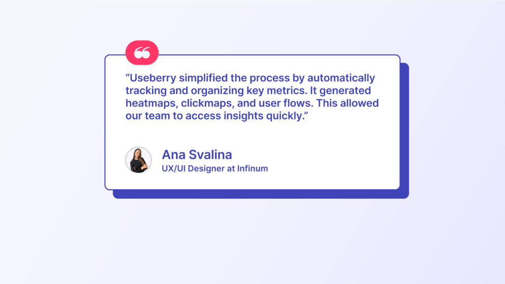
Open-ended answers were analyzed via affinity mapping, helping the team cluster insights around trust, clarity, and differentiation.
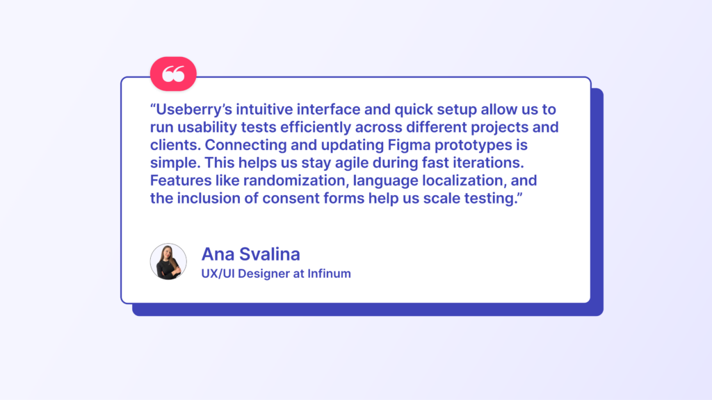
What the Infinum team values most about Useberry:
✅ Intuitive UI and fast setup
✅ Completion rates, total time on study, drop-off rates, and detailed analytics
✅ Easy integration with Figma prototypes
✅ Wide range of testing methods
✅ Localized tests and consent forms
✅ Real-time data and participant recruitment options
As an agency, Infinum relies on tools that are easy to set up and scale across different projects. Useberry helped reduce prep and analysis time. Real-time results tracking and accessing behavioral data sped up reporting. Creating different test versions within a project was also a huge plus.
The Results
The usability studies provided clear, actionable insights that directly influenced design decisions across three client projects.
Let’s explore in more detail how Useberry helped each client shape a more effective digital experience.
Investment bank (live website)
- The design was perceived as professional, trustworthy, fresh, and innovative, which aligns with the intended brand strategy.
- Initially, users saw the site primarily as an educational platform, which has since been clarified to reflect the company’s core business.
- Heatmaps revealed where users intuitively clicked to explore the homepage, and user behavior varied by experience level. Less experienced investors spent more time on the landing page, while experienced users navigated directly via the menu.
- Based on these insights, the content was adjusted to align with each group’s interests and vocabulary.
Interesting insights for the investment bank:
- Misaligned perception: users initially misunderstood the company’s purpose, seeing it as an educational platform
- Experience-based navigation: less experienced investors spent more time on the landing page, while experienced users navigated directly via the menu
- Search bar underused: users didn’t really use the search bar to explore the topic
- Icon clarity issues: users had difficulty understanding certain icons (copy link, download PDF), which led to the redesign of these icons for better clarity
- Flexible navigation matters: users used different paths to achieve their mission, so having multiple ways to navigate is beneficial
Digital agency (live website)
- The key finding was that people loved the website, and it performed well or very well across all tested aspects.
- First impressions were very positive, and overall, the trustworthiness, clarity, relevance, differentiation, and activation scores were high.
- For this project, the conclusion was that a redesign is not needed, only a few minor improvements to the existing website. This validated the current design and gave the team confidence that their work was on the right track.
Interesting insights for the digital agency:
- Strong first impressions: first impressions were not just positive, they were exceptionally strong, suggesting that the visual identity and initial messaging are hitting the mark
- Human connection improves trust: trust could be enhanced even further by featuring the real people behind the company
- Tone of voice validated: The tone felt highly relevant to the audience, and no changes were needed
- Statistical skepticism: people don’t always trust the 95% business fail claim and wonder what the source is
SaaS tech company (redesign proposal)
- The redesign proposal was rated as professional, premium, and trustworthy in the desirability testing.
- Metrics for clarity, trust, relevance, and value all ranked high.
- Regarding research methods, open analytics showed where users hesitated or dropped off. Heatmaps suggested navigation is one of the most common areas users click on. Preference testing highlighted which design resonated better with the participants.
- The tone of voice emerged as a critical area for improvement. Users skimmed the content and skipped all the marketing fluff. Product screenshots were very important as users relied on them when they wanted to determine if the company was a good fit for their needs. Also, independent user reviews greatly impacted the perceived trustworthiness of the product.
- A key barrier was pricing visibility. Many users indicated they would not reach out without seeing pricing information first.
Interesting insights for the SaaS tech company:
- Avoid the marketing fluff: users actively skip the marketing fluff
- Numbers build credibility: when commenting on why they trust the company, participants mentioned numbers on the web and website design in general
- Put people in the focus: seeing reviews, success stories, and people behind them would make the users trust the company even more
- Be conversational: use the communication style you would use in face-to-face conversations
- Show, don’t tell: illustrate points with real examples and use screenshots to make the information more tangible
Overall, all three studies revealed that the human element is the most important factor in building trust and clarity in a marketing website. So, always try to incorporate reviews, success stories, case studies, and people behind them to achieve this.
Ana Svalina, UX/UI Designer at Infinum
Conclusion
Infinum’s case study with Useberry shows how important it is to include user research in the design process. By focusing on user feedback and using our easy-to-use testing tool, Infinum creates marketing websites that reach business goals and build trust with users. This case study is a great example for other agencies and product teams who want to use data from UX research to improve their results and make user-friendly products.
Ready to boost your UX research like Infinum?
Get started with Useberry today.