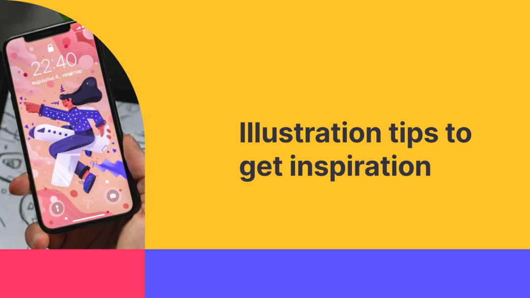
Humanizing our designs is not just cool, it is right.
It’s a fact that we, as users, are first of all humans and specific things will stimulate the respective emotions in our minds. Illustrations, therefore, should be one of your tools when designing something or for rebranding.
Note that I don’t think that the recent trend of using disproportionate body illustrations (which employ the guerilla theory) has a place in the future. I personally expect that these designs will fade away very soon (I confess that I’m a little biased as I kinda hate them).
Quick tips
You’ve created your very first illustrations and are seriously thinking of incorporating them into your websites. Okay. Here’s a quick checklist to see if your illustrations pass the test:
Illustrations must transmit the same message as your whole website
Having illustrations here and there is a bad practice not just for UX but also for your website’s aesthetics.
Illustrations must have the same style
Consistency is the key when using illustrations. From your marketing activities to landing pages to homepages to 404 pages and so on there should be consistency.
Illustrations’ objects picked strategically
Pick the objects very carefully so they won’t trigger the wrong feelings but the ones you are scoping for.
It’s not an art it’s business
Remember, the main reasons for your illustrations to be incorporated in your designs are because they add to the UX of the website/app that in return will help you grow/satisfy your users that in return will increase your business’s bottom line.
Never copy but take it to the next level
With illustrations, you can easily fall into the trap of coming out as identical to other websites (70% look the same).
Optimally, test them to see how your users perceive them
It’s easy as a, b, c to do it. Start here for Free (no subscriptions).
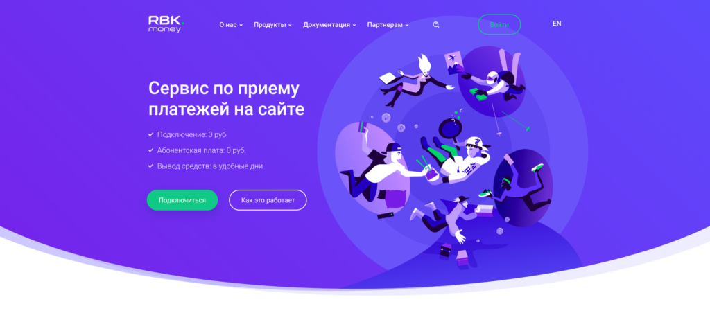
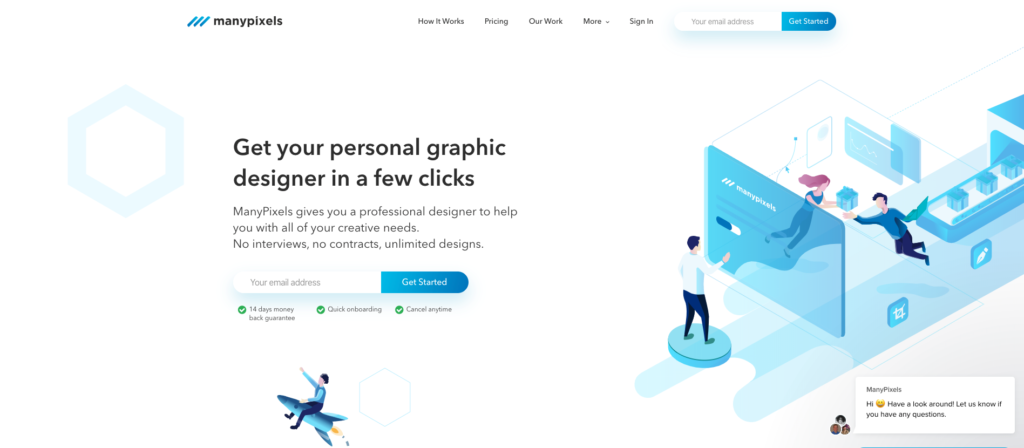
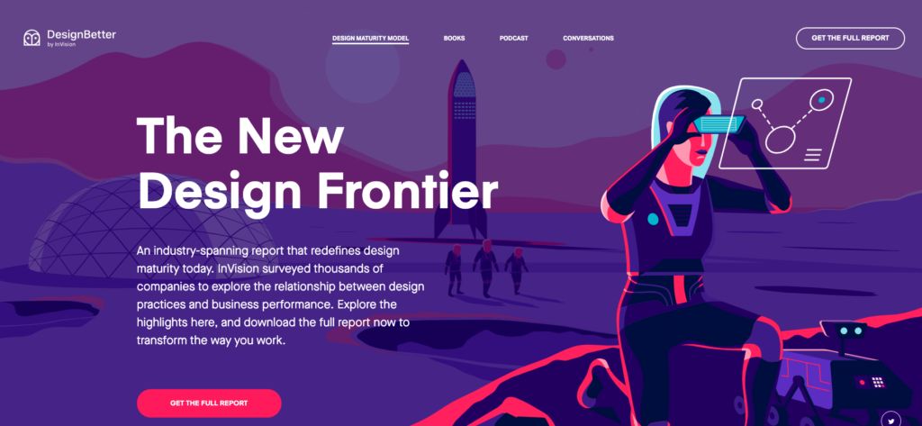
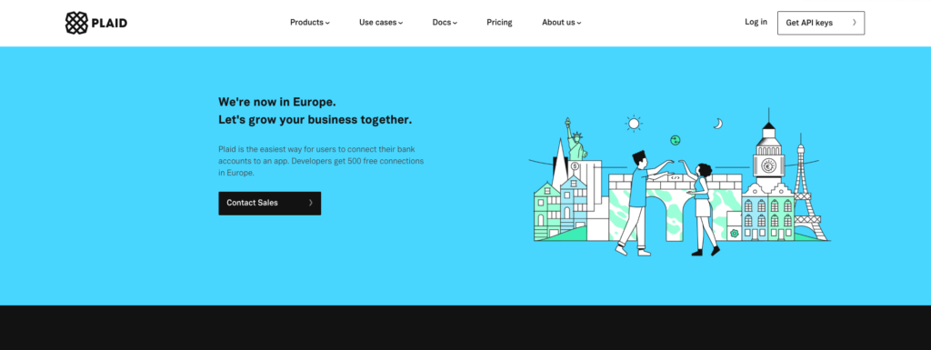
Good examples of illustration-based websites

Feel free to contact us!
We’d love to know your experience with Useberry and we will be excited to hear your thoughts and ideas.


