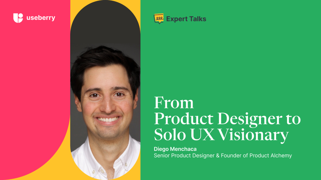
Introducing “Expert Talks” – our new interview series that brings the human side of UX research to the forefront. In this kickoff interview, we sit down with Diego Menchaca, Senior Product Designer and founder of Product Alchemy, to discover his journey from senior product designer to founder and the pivotal role of UX Research in shaping his design process. Join us as we explore the stories, insights, and expertise of industry professionals, aiming to both inspire and provide valuable insights to our community.
Design Journey: From Playing with Legos to Becoming a UX/UI Designer
What led you to be a UX/UI designer?
As a kid, I enjoyed nothing more than drawing, designing, and creating things. I played with Legos all my childhood and took every chance I could for creative hobbies.
As I became older, I put my artistic skills on hold; I went to business school for university, and in 2013, right out of college, I founded Teamscope, a data collection platform for medical research.
With Teamscope, I had a few failed attempts at hiring UX and web designers, and then in 2016, I decided to try it and do all of the product design and web design for Teamscope myself. Being the CEO and doing product design at the same time was perhaps not very efficient, but it allowed me to do something I loved every day.
When did you decide to be a full-time product designer?
In 2022, Teamscope was acquired, which allowed me to look at my future with fresh eyes, and so I decided to spend my time doing what I love: designing products and websites.
That led me in November 2022 to launch Product Alchemy, a design service for startup founders that allows them to request unlimited UX/UI tasks for a flat monthly subscription. Product Alchemy is a one-man business and a way for me to work intimately with startup founders and help them ship kick-ass products.
I’ve had the pleasure of working with some amazing clients, including Yhangry, Testsigma, Lobster Ink, and DesignPro.
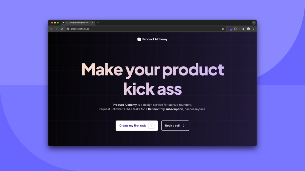
You mention Product Alchemy is a “Company of One” (Inspired by Paul Jarvis’s book “Company Of One: Why Staying Small Is the Next Big Thing for Business”). So, what’s the next big thing for your business?
That is an interesting question because a “company of one” challenges the idea that a business must grow big. A “company of one” exists because it defines what is enough. In my case, “enough” for Product Alchemy is making €100k a year and the freedom to work from wherever I want. That “enough” allows me to live comfortably and a simple life. At this moment, I don’t need more.
The “company of one” mindset limits growth but opens up a fascinating world of freedom. To be transparent, in 2023 I closed off at €77k in revenue, which is lower than the yearly financial objectives I had, but it occurred because I took a 3-month pseudo-sabbatical where I went to Bhutan to teach a full-time course in UX/UI design.
If Product Alchemy was an enough-less business, that level of agency over my time and freedom to take off to the Himalayas for 3 months would be tricky to achieve.

While Product Alchemy stay as it is, I’ve recently launched a new agency called Motion Gurus focused exclusively on making custom animations for SaaS startups. If you need interactive animations that will make your users go “Holy Shit!”, this subscription service could be a game-changer for you.
What role does user testing play in your design process?
User testing is a powerful tool. Whenever we feel we have a risky assumption underpinning a design, user testing comes into play. An example of a risky assumption is:
“Users would understand this new feature to the extent they can teach it to others.“
If we read that assumption and our gut feeling tells us the user may have trouble teaching that feature to others, this is a sign that the sane thing to do is to conduct user testing.
Another simple assumption I come across with my clients is:
“First-time visitors on our site understand our business and can explain it in their own words.“
We can quickly test that assumption by running a 5 Second Test (by far my favorite test) and measure the gap between what we are trying to communicate and what we effectively communicate.
Design Wisdom: Embracing Failure, Design Misconceptions, Essential UX Skills and 2024 Design Trends
If you had a chance to go back in time and give your younger self one advice when you first started, what would it be?
Be more careless. Please take this with a pinch of salt; it is, by all means, not advice to anyone else except to my younger self. We are all different.
For most of my career, perfectionism and imposter syndrome were my biggest obstacles. I doubted even the tiniest things, like what I would post online or who I could contact to offer my product or service. Now, I try to do the complete opposite. Instead of trying to be successful in what I do daily, I use my brainpower to look actively for ways to fail. This mindset has resulted in 10x more work output and living a lighter life. To my dear self from 10 years ago: look for ways to fail and give less fucks.
What type of projects or challenges do you find most exciting to work on and why?
In terms of challenges, I love working on redesigning messy user flows and turning confusing products into something that my mom could use daily.
In terms of project types, I love focusing on user onboarding. If we get it right, it can impact the business the most.
Are there any popular misconceptions people have about design processes that you’d like to debunk?
- A rough and ugly paper sketch is a more powerful artifact than your pixel-perfect design. Putting perfection on a pedestal limits everyone’s ability to think visually. Make more paper sketches and encourage everyone, especially non-designers, to bring visual ideas to the table.
- Time distribution for a product designer should be 80% interfacing with users and 20% on Figma. Flip that ratio, and you will have tunnel vision and spend time perfecting things users won’t care about.
- Avoid at all costs product walkthroughs. Welcoming a new user with a product walkthrough is terrible UX. Instead, identify the underlying cause of why the product needs a walkthrough in the first place and resolve it.
What do you think is the most important skill a UX designer should work to develop?
The number one skill a UX designer should work towards is communication and explaining your process. Creating pixel-perfect designs is no longer an issue; we have plenty of tools that democratize that, like Untitled UI for a component library or Mobbin for getting quick references.
The crux of our work is communicating to stakeholders why we do what we do and what our thinking process was to get to that solution.
To sharpen this skill, I highly recommend reading Continuous Discovery Habits by Teresa Torres and using a visual tool she proposes in that book called Opportunity Solution Tree (OST).
Opportunity Solution Tree is an essential visual methodology that empowers product teams to define their desired outcome and map the opportunities and solutions to help them achieve their objectives.
Are there any emerging trends in product or UX design that caught your attention?
The first most significant emerging trend in 2024 is the infusion of generative AI across products, mainly through OpenAI’s API.
We will see that the input fields on products across industries will be, by default, AI-aided. For example, suppose you want to sell your bicycle on a marketplace platform. While typing out the product description, you will notice that the AI will provide suggestions to improve it, correct spelling errors, and enhance the description to make it sound like an irresistible opportunity to potential buyers.
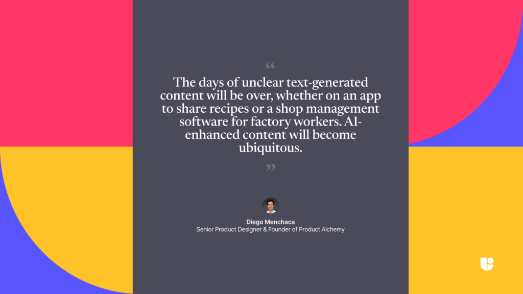
The days of unclear text-generated content will be over, whether on an app to share recipes or a shop management software for factory workers. AI-enhanced content will become ubiquitous.
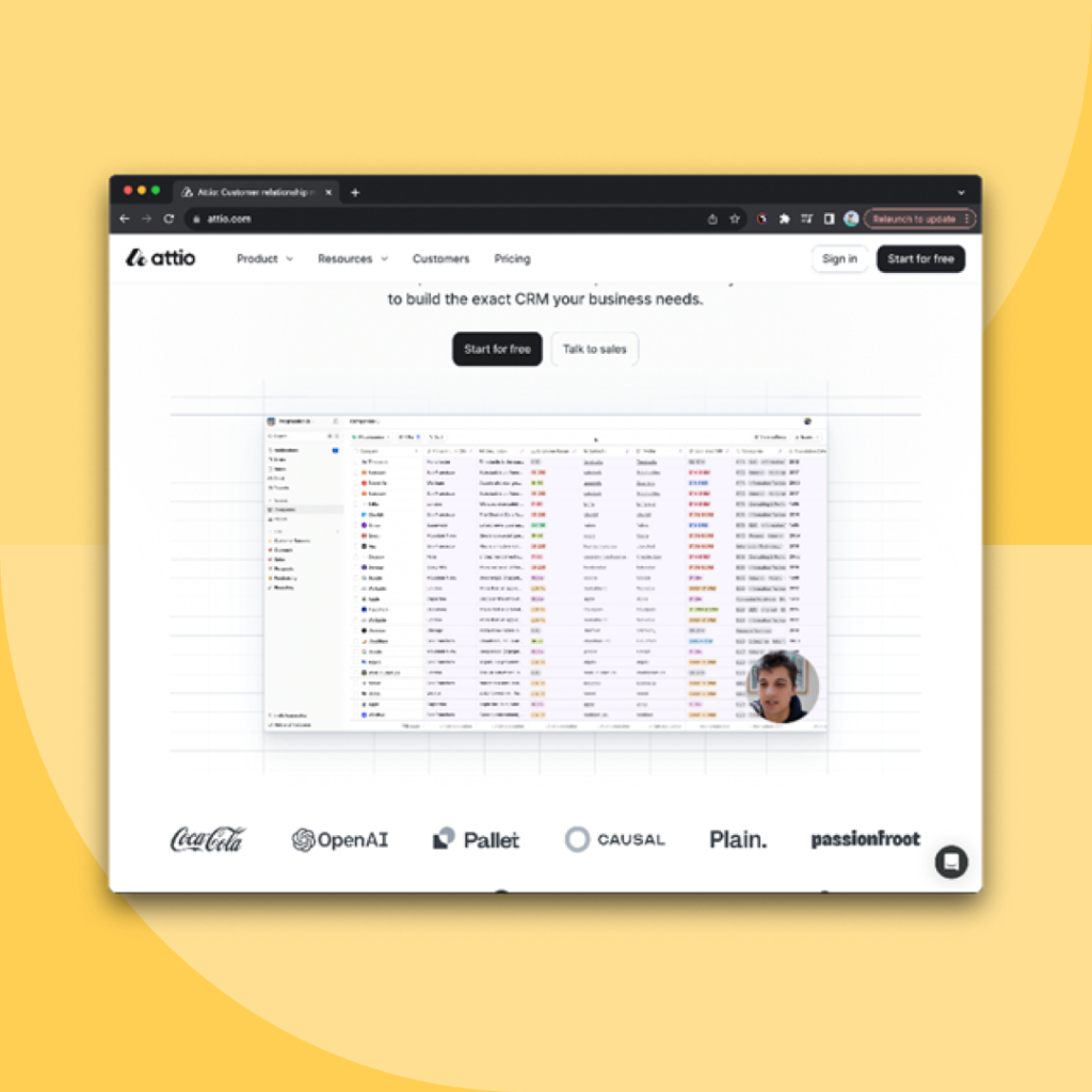
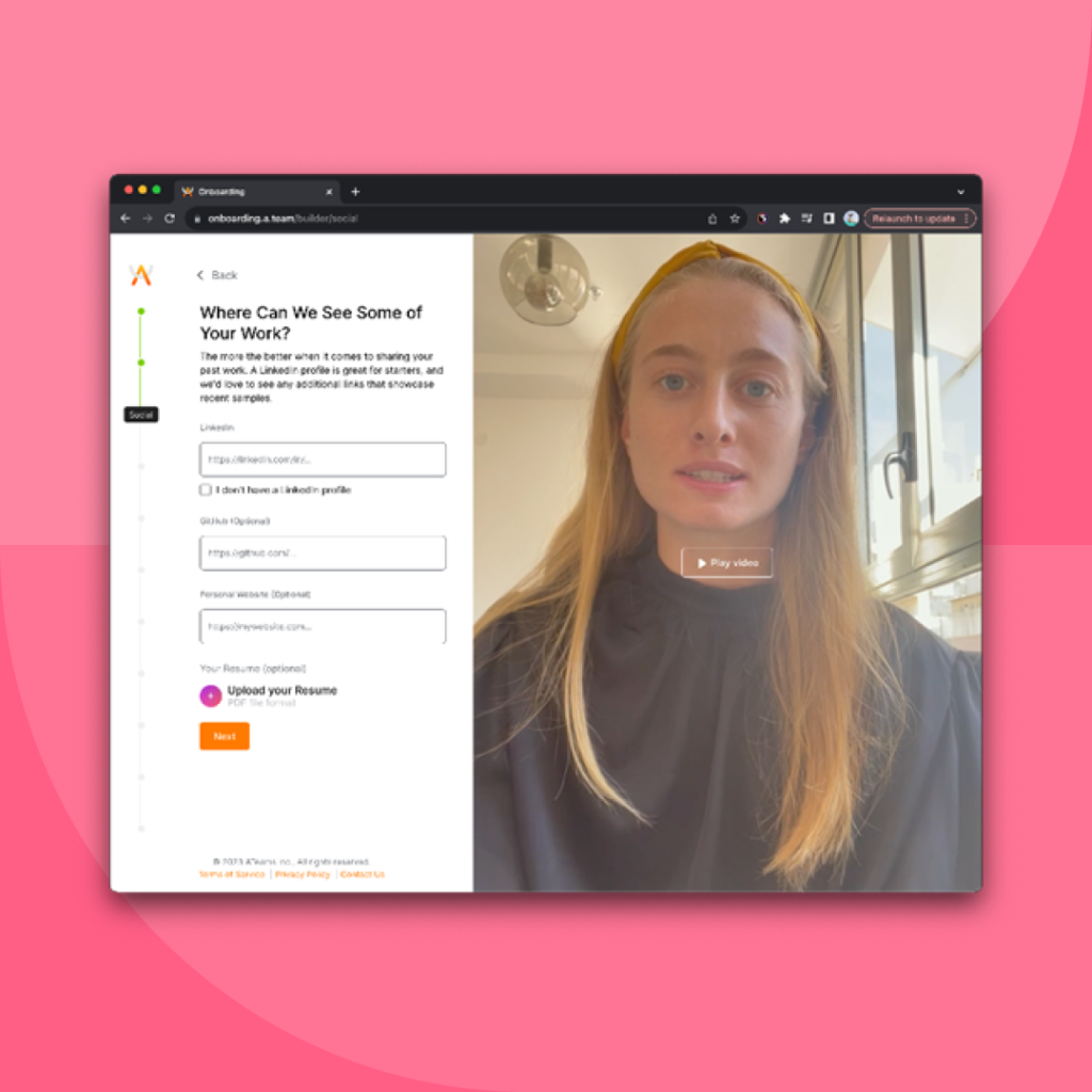
The second most significant trend is using authenticity. We will see more products that enrich their users’s journey with videos of their founders and teams. An example of this is Attio, where on the home page, the founder explains the platform in a candid loom video or on A.team where the user registration process is aided by short videos of the staff walking you through each step. On my websites like Product Alchemy and Motion Gurus I always use a candid video of me welcoming the visitor and explaining what my service is about.
The last major trend I see is a considerable increase of motion design in product/UX design. We will see more tech companies saying goodbye to their classic 2-minute explainer video and infusing their landing page and products with interactive animations. Excellent examples of this are the websites of Wope, Rise Calendar and Attio.
Designing with Empathy: The Vital Role of Useberry
Can you tell us about the impact of UX research on your design process and the tools/methods you use?
For a designer to be goal-oriented and create a clear vision of where she wants to go, she must “begin with the end in mind.”
Stephen R. Covey popularised this habit in his book The 7 Habits of Highly Effective People.
In the context of product management, doing things with the end in mind is only possible with the help of UX research. That’s when we can think exploratory and be mindful of our assumptions.
Some teams may find UX research as something dense and time-intensive, but it doesn’t need to be, and the efforts you deploy can be gradual and pragmatic.
You can start by having a single product discovery call with a client per week and using simple usability tests like 5-second and First-click tests, which take minutes to set up and can provide valuable insights.
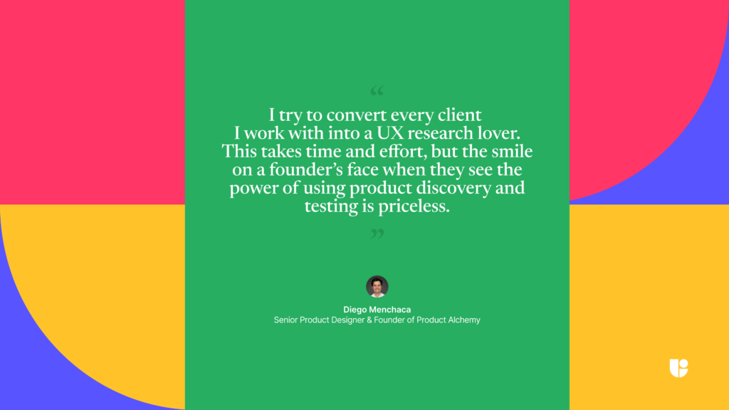
I try to convert every client I work with into a UX research lover. This takes time and effort, but the smile on a founder’s face when they see the power of using product discovery and testing is priceless.
How did you come across Useberry?
As a freelancer working with clients of different sizes, I need a tool that is easy to use and reasonably priced.
My first use case for Useberry was conducting my favorite test, which is a 5-second test for a new landing page design I did for a client. Once I saw how easy that was to set up and execute, I moved on to running a usability test for a feature I designed for another client. In that case, my design was on Figma, and I could easily embed that prototype on Useberry.
What is the one feature of Useberry that is a must for you? Why?
There are two must-haves for me on Useberry: the ability to embed Figma prototypes easily and fair pricing. As a Figma fanboy, I need a user testing platform that supports it; without it, I would need to look further, and pricing is a significant element. For a freelancer working with multiple clients at any given moment, I need to be able to run multiple projects simultaneously without pricing scaling wildly. The other competitors in the industry have pricing models, which may be great for large organizations but are not oriented to smaller teams.
Has a project ever gone wrong because you hadn’t grasped what users actually needed?
Absolutely, and every product manager and designer has countless instances where we shipped something off-target.
Although, as product managers and designers, we know every single screen and all the tiniest details of our product, the chance of us delivering a solution that users don’t need is high. Our knowledge of our product is our biggest strength and, simultaneously, what makes us biased and not the actual user. The only antidote to that bias is to pause, get a client on a video call, and ask good questions.
For users, who want to try or are new to Useberry, what advice or tips would you give them to get the best out of the platform?
Start with a simple test like a 5 Second Test to get used to the platform, and don’t be shy to reach out to the support team; they are amazing, answer within hours every single time I’ve reached out, and can set you up for success.
UX Fun Round
If you could design/research/develop/program anything in the world what would it be and why?
I’ve never designed a party game app, and I would love to take on that challenge one day — design something for the pure sake of laughing and having fun.
If you could collaborate with any team or a person on a project, who would it be and why?
To be honest, none in particular. As long as the teams or projects I work with give me direct access to communicating with users to understand what life looks like from their perspective, I’m excited to collaborate with any team.
Do you have any rituals that you always follow before starting a project?
Before the project starts, I record a first-impression loom video of the client’s current website and product. It’s a ritual I do with every single new client or lead, and that loom video helps me capture all of the first things that come to my mind as I’m trying for the very first time to understand what this product is about. That first impressions video will often provide low-hanging fruits that, if improved or redesigned, the UX can be quickly improved.
Are there any “must” routines for you while working on a project?
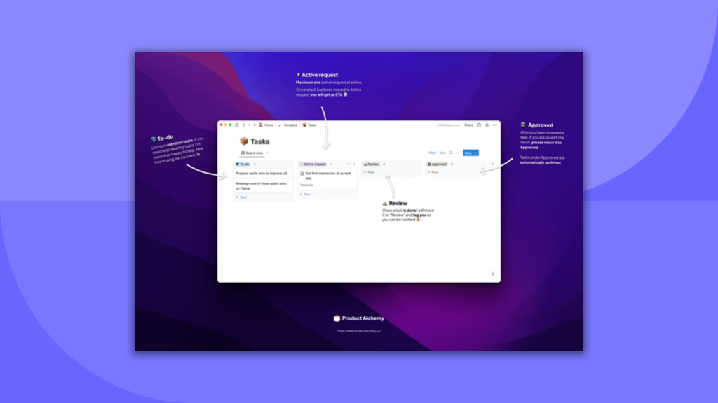
With every project, I work with a kanban board I create for my clients so they can keep track of what I’m working on. For every single task, I give them a precise ETA, and for every delivered task, even if it’s a tiny thing, I explain what I did with a loom video. Those small things bring a lot of sanity into my workflow and give my clients the service they deserve.
Conclusion
In this insightful journey with Diego Menchaca, we’ve taken a look at the world of UX/UI design through his eyes, seeing how he applies the transformative power of user testing to his product design. Diego’s story, from playing with Legos to founding Product Alchemy, is a testament to the relentless pursuit of passion and the importance of embracing change. His approach to merging business acumen with a deep understanding of user experience highlights the importance of empathy and communication in design. As we reflect on the emerging trends and invaluable wisdom shared, we once again emphasize the importance of crafting experiences that resonate with users over focusing only on visually appealing designs. We would like to thank Diego for sharing his journey and insights, and we hope that they serve as an inspiration to aspiring designers and entrepreneurs.
We hope you found this interview as enriching and engaging as we did. And the excitement doesn’t end here! If you would like to hear from more industry leaders and pioneers about UX Research or UX Design, stay tuned for our next interview in the “Expert Talks” series!
Connect with us!
Curious about how Useberry can enhance your UX and Design journey? Contact us to ask a question or to arrange a personalized demo.


