Last year I wrote about the UX Design Trends of 2025 and tried to stay away from shiny buzzwords in favor of what I was actually seeing in the field. Now that we are more than a month into 2026, it feels like a good time to check what really stuck, what is changing, and what I believe will become “just how we work now.”
This is not a yearly reset. Many of the themes from 2025 are still here. Personalization, better research habits, and more ethical design are still getting attention. The difference is that they look less like “trends” and more like habits that shape how teams design, test, and develop products.
Here are the shifts you should expect to see in design work in 2026.
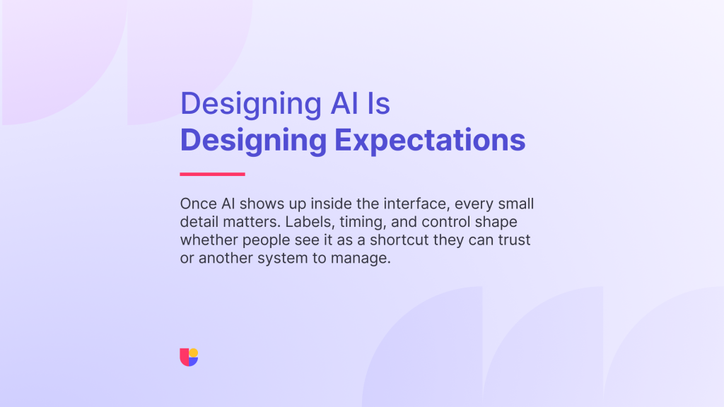
From “AI in tools” to “AI in the Experience”
In 2025, most of the AI conversation in design happened inside tools or as supplementary tools. There were talks about AI assisted layouts, faster analysis of research, and help with copy. That is still happening, but this year I see more teams asking a new question: what does it mean for AI to be part of the product experience itself?
Designers are being pulled into decisions about:
- how AI suggestions appear inside the interface
- how much control users have over automated actions
- what a helpful AI “voice” or suggestions feels like in the context of the brand
This is where patterns are less mature. There is no single “correct” way to design a recommendation, a generated summary, or an AI driven shortcut. Teams are experimenting with small badges, clear explanations, and ways to let users correct or override the system.
It is not as straightforward as it seems, even when it comes to something like “control”. Of course as a designer, I want as much agency and control as possible but when does it stop becoming agency and starts becoming mandatory manual review?
From a UX point of view, this means we have to design for new experiences and trust. It also means more testing. We see more teams using quick usability tests and prototype tests to understand how people react to AI inside websites and products (not only in the workflow that creates the product.).

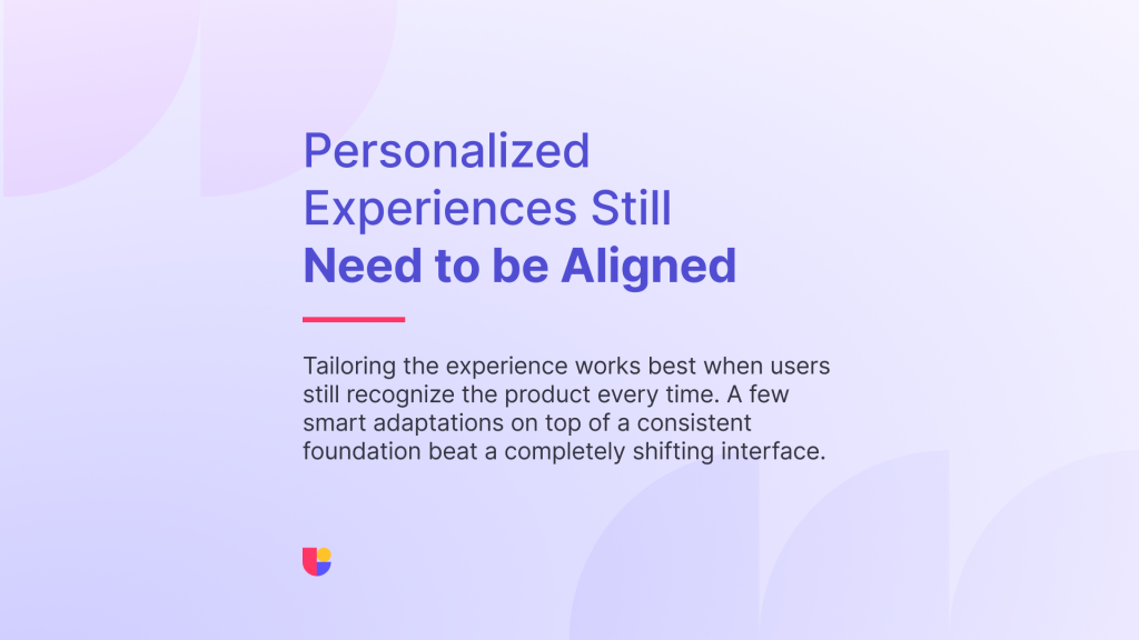
Personalization Grows Up
Personalized user experience was already on the list for 2025. In 2026, the conversation is less about “can we personalize” and more about “where should we, and where should we not.”
The more we tailor experiences, the easier it is to accidentally create confusion. People need to recognize your product each time they see it, even if some parts adapt to them. The sweet spot is a stable core with a few thoughtful places where the interface responds to behavior, preferences, or context.
I see teams using personalization most effectively in:
- onboarding flows that adjust based on experience level
- dashboards that highlight the next most useful action instead of everything at once
- content that shifts slightly based on previous choices
The design challenge is to keep the mental model intact. If two users compare notes, they should still feel like they are using the same product. Testing different levels of personalization with small user groups is becoming a normal step, not a special experiment.
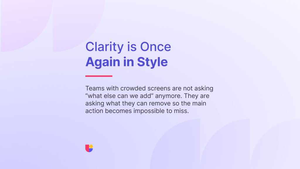
Less Decoration, More Focus
We have more tools, more channels, and more notifications than ever. The response I see from mature teams is to remove as much noise as possible.
There is a clear trend toward calmer, more focused UI that respects attention. That shows up as:
- fewer competing calls to action on key screens
- typography that does the heavy lifting instead of decorative visuals
- motion that explains state changes rather than distracts
This is not minimalism for its own sake. It is a reaction to cognitive load. When everything is loud, clarity becomes the differentiator. I often see these decisions happening after teams run a five second test and review the click tracking results. If people cannot tell what matters on a screen and act how you expect on time, the default now is to remove the distractions.
4. Accessibility as a Baseline, Cognitive Ease as the Goal
Accessibility has been moving into the core process for a while. In 2026, more teams treat basic accessibility as part of the MVP. The interesting shift I see this year is more attention on cognitive ease. It is not only about whether someone can technically use an interface. It is about how much effort it takes to understand it.
This shows up in:
- plainer language instead of “clever” phrasing
- simpler flows with fewer steps where possible
- more generous spacing and clearer grouping in interfaces
User testing is vital here, especially with diverse participants. A layout that looks “clean” to a designer might still feel like work to someone who is tired, distracted, or less familiar with the product space. Watching recordings and running task based tests keeps that reality in view.
Research is a Core Part of Design Workflow
In my 2025, one of the themes was that UX research is everyone’s job. That idea has started to solidify into practice. This year, I see more teams building small research habits into their design flow instead of treating testing as a separate stage. That can look like:
- running a quick unmoderated study before a design review
- Incorporating recordings into team meetings
- pairing every major change with at least one small user test
Of course, at Useberry we make sure this process is as easy as possible. Designers can take advantage of our design integrations, quickly pull up their design and start setting up their study. They can even use a ready-made research template and recruit from our participant pool to speed up the process even further.
For design leaders, the focus in 2026 is less about convincing people that research matters and more about helping them do it with ease. Tools that helps you ask the right questions or pick the right setup, and share findings easier in a way will come out as winners.
Teams Care More About “how we work” Than Checklists
The last shift is more cultural than visual. There is still plenty of interest in checklists, but the teams I talk to are more focused on their own practice than on chasing a particular structure.
Conversations sound like:
- how do we keep research close to each sprint
- how do we use AI in a way that is transparent and helpful
- how do we keep design, product, and marketing aligned on what users actually need
- how do we make sure accessibility is considered early
Trends are useful when they frame these questions. They are less useful when they turn into a checklist of UI patterns to copy.
We watch where the work is moving, then ask how our platform can support that direction. Faster validations, better results, and easier recruitment are all part of that response.
Looking at 2026 With a Practical Lens
If I had to sum up UX design in 2026 with a single idea, it would be this: less prediction, more observation. AI is in the room, personalization is getting sharper, and interfaces are becoming calmer and more intentional. The teams that seem most confident are the ones that keep checking their ideas against real behavior and keep their rituals small and repeatable.
You do not need to follow every trend to stay relevant. Keep asking simple questions like “how does this feel for a first time user” and “what did people actually do when we tested this.” If a trend helps you answer those questions better, it is probably worth your attention this year.
Apply trends with confidence
If any of these UX design shifts feel familiar, start by testing one of them in a small way.