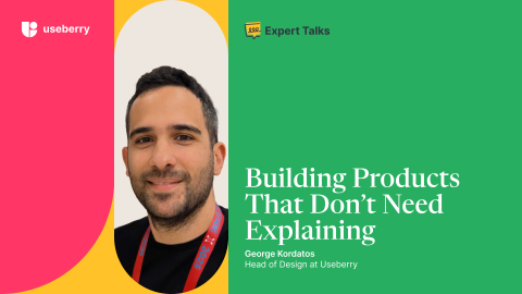
Editorial Expert Talks with George Kordatos: Designing Without Guesswork Yigit Barlas February 19, 2026
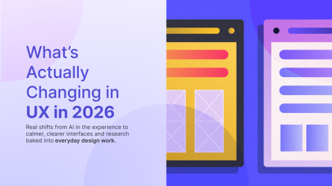
Editorial Beyond Hype: UX Design Trends That Actually Show Up in Work George Kordatos February 18, 2026